-
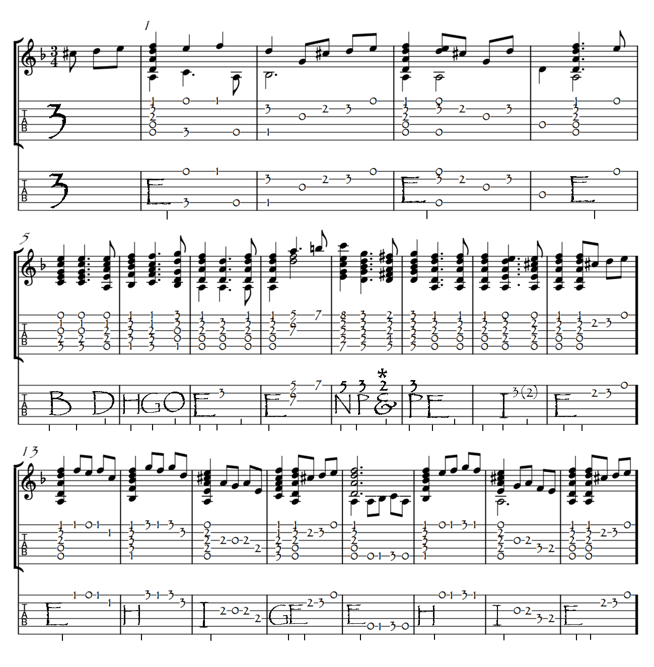
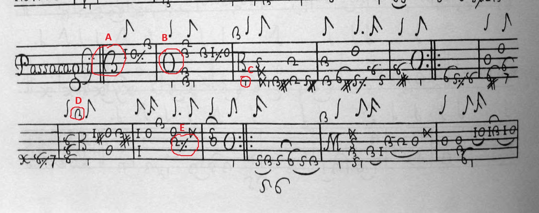
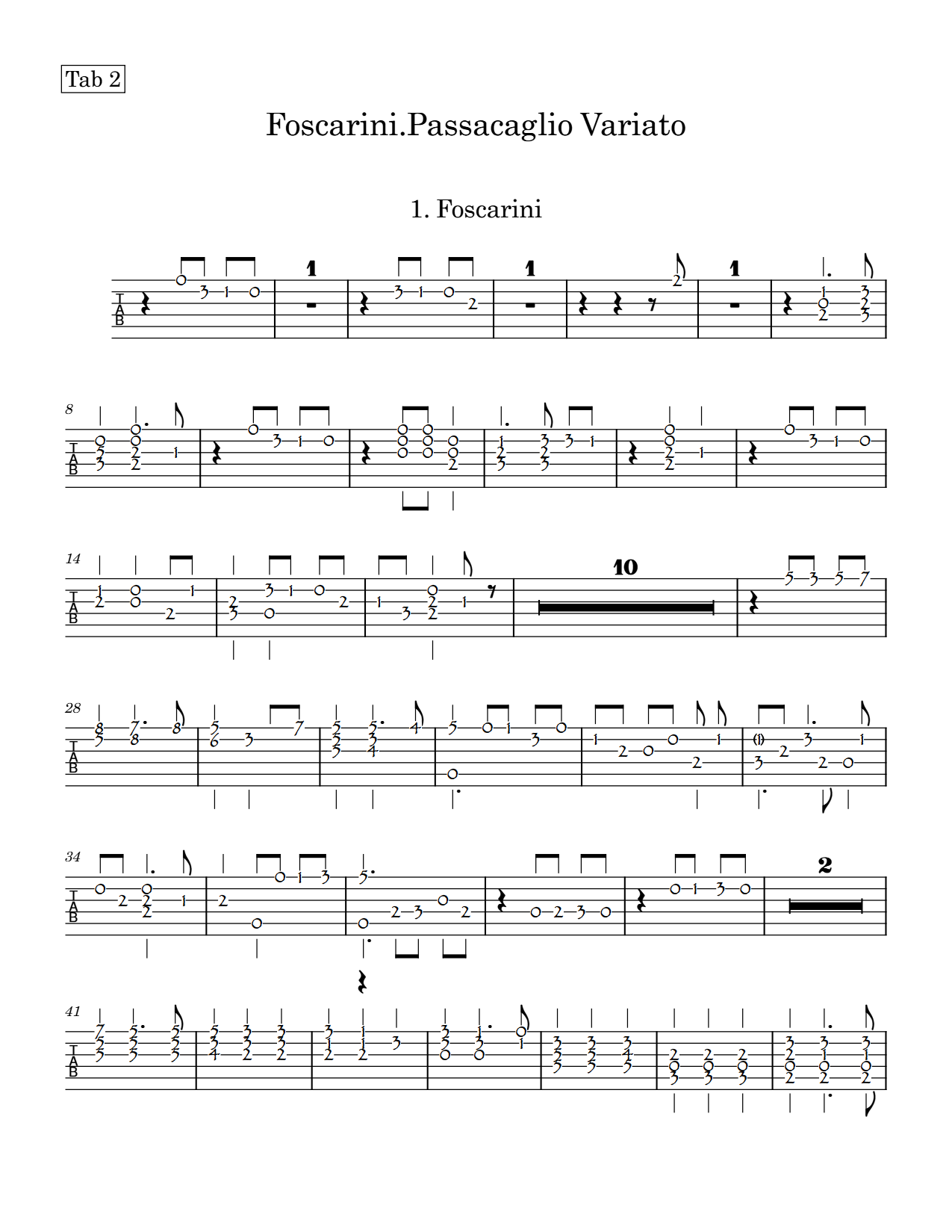
I am trying to notate some 17th century Baroque guitar stuff. Is there a way to notate any of these graphics? As you can see, in my version I have used photo shop. It is very time consuming.
-
When I try to export graphics for just the bottom staff (the top staff and middle tablature staff are in modern notation and transcribed for modern guitar. The bottom staff is a modern, tidied up version because not everyone had nice handwriting back then. It is transcribed to reflect the facsimile. You can see in the last graphic that it shows rests and does not leave room for the alphabet symbols.
Thanks for any advice you have.
Lute and Baroque Guitar notation is not yet supported.
I would recommend that you don’t use Photoshop, but use a vector graphics editor like Inkscape, Affinity Designer or Adobe Illustrator.
A vector drawing app will preserve the individual components – the lines, numerals, and music font symbols – and let you move them, change their size/shape, position them on top of others, etc.
A Photo editor creates a bitmap image, which is pixelated, and everything is just shades of colour, not ‘objects’.
I’m not sure I understand your second point. Is it the multi-bar rests in 39-40 that you don’t want?
… Would that be Papyrus, the well-known 18th-century typeface..? 
Bahaha.
Why does Papyrus catch so much crap?
You have any recommendations? At this point, I am wondering if calligraphy lessons would be less time consuming. I tried some medieval fonts, antique fonts, calligraphy fonts.
As for the second question, I don’t want rests to show when exporting only the second tablature. That is the one that I will use in the graphics editor.