Dan, this would be very useful, I will purchase from Notation Central when ready ![]()
Thanks! Any input on things that are missing?
Not yet, although I’m not doing any guitar things at the moment, Thanks for asking
@ Dan
-
Roman numerals: Uppercase
I, II, III, IV, V, VI … to XIV should probably be enough for classical guitar
But an electric guitar has 20-24 frets!
I would say allow the maximum
-
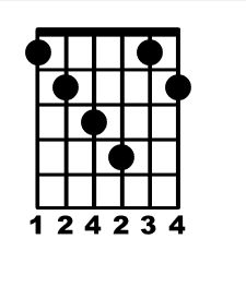
Examples from the image below:
In Am11, C9sus4 and Am6 the root note is on the sixth string
In Dm9 the root note is on the fifth string.
As a guitar player, most of the time:
. I memorize and visualize the chord diagram from the root note
. I look for the root note on the fretboard
. I place my finger accordingly
For such chords it is great to have the fret number where the root note is and I find it really usefull to differentiate the root note dot, either with a circled dot or with a white dot.
- Interesting question
Not so easy to answer.
I asked for this because most of the chord diagrams I use are for 3 frets only.
Spontaneously I would say bottom align.

All of that is pretty easy to achieve, except for bottom-aligning the smaller fretboards. That’s actually proving to be prohibitively complicated, so I’ll need to top-align them.
Nice to hear ![]()
and no problem with top align.
Some thoughts
Usability
It seems as if your font could not only complement but eventually replace (at least for me) Doricos chord diagrams features.
I just made some test:
I created a mini chord diagram library in a text app.
From there it is very easy to copy and paste into a text block in Dorico.
If you create a specific Paragraph Style for chord diagram, it could at the end be more flexible than Doricos feature because of the fact that you can place a chord diagram where ever you want undependently of the visibility of chord symbols and not having to take care of the in my view convoluted way (at this time) in Dorico to show or no show chords symbols and chord diagrams.
Font style
Individual taste about font style, weight and size is of course very subjectiv and I can’t imagine that a specific choice can please everyone.
For example I would prefer a thinner font for the fingerings and possibly a serif style depending on the context.
A short try to edit the fingerings numbers in Fontforge did not work.
I assume that because I edited the .otf the anchor points were missing or something like this.
I know how to edit a glyph in FF but I never worked with diacritic or ligatures so I have no technical knowledge about the consequences when you change the size or the style of a glyph.
So my question is, if one would like another style, and as you probably cannot please every one, is it something one could change easily on its own without to have to go too deep in the technical aspect of diacritic?
You’re welcome to edit it however you want, since it will be released as SIL (open license). But you’d be on your own as far as how to do it. I did reduce the size of the finger numbers, which may be ok for you now.
Here’s a nonsense example:
If you want to edit the size of these numbers, you’d just want to make sure to keep the anchor points at the top-center of the glyph.
Hi Dan,
thanks for your info.
And sure I understand that if, at all, I have to learn by myself.
Also thank for the hint and the placement of the anchor point though as I am not able to see any anchor points in your font either in the glyphs themselves or in the lookup subtables I guess it will be a long way until I understand what to do ![]()
Yes, the smaller number size fits my taste more, thank you.
I assume you will tell when a new version including these changes is available?
Yes this font will soon be available on Notation Central. If you get it there you’ll be notified whenever there’s an update.
OK, thanky you.
@teacue I’ve posted an update for you to try. Roman numeral option for frets, up to XIV. They can be moved down down using d, dd, or ddd suffix.
3-fret or 4-fret grids, top or bottom aligned. And add a “w” after a fret number to make it white (hollow).
I’ve updated the documentation (still a simple text doc at this point). I believe it’s close to being released.
Great!
Much much thanks, you are quite fast ![]()
It works really very well.
I find your solution to move the fret number very practical and easy to use.
Nice.
Dare I nevertherless mention one thing still?
Sorry that I forgot to describe this case (I did this already but one year ago in another thread: FR Fingerings in guitar chords diagrams)
It would be nice to differentiate the root note dot also when the root note is an empty string.

Hey Dan - @dan_kreider - your timing might perfect! I’ve been (badly) trying to create some chord diagrams for Ukulele for a musical - chords that are not common to most players. Do you plan / or is there already - a way to have a four string version (0r 5 for banjo etc). In any event the guitar version will be very useful to me.
Just downloaded and will read the manual and play around with it. Can it be used in Dorico Elements ?
1 Like
I hadn’t made a 4-string version, but I suppose it would be pretty easy. Anything specific I’d need to know?
that’d be great! No, can’t think of anything in particular. I’m not a Uke specialist but have a couple of actor basic Uke players in the show who don’t read dots or tab so being able to give them diagrams in a crib sheet for each song will be really helpful.
Just playing with the current one in Pages now, works well.
Just tried it in Affinity Designer where it also works well.
Not the white finger numbers inside the fret though, right? I believe color fonts are not supported in AD, so that bit is MIA.
I’ve posted an updated version of MusFrets in the folder linked above. There are a number of new, mostly-done-but-yet-undocumented goodies in there, but the operative addition for you is U for uke, and UU for uke without the nut.
Thanks you Dan! Amazing - I hadn’t tried the white finger numbers inside fret tbh - not something I’d use a lot anyway I don’t think.
Where in the sequence does the U fit?
At the very beginning. U instead of #.