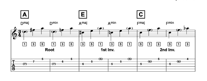
I’m attempting to recreate a worksheet I’d previously made in Sibelius (and made in Finale before that). It’s guitar-centric so I’m indicating basic “shapes” that each arpeggio relates to in the large letters in boxes, and scale degrees in the smaller numbers in boxes.
I can’t figure out how to put letters and numbers into perfect squares. Dorico allows me to make boxes, but the size is inconsistent and changes depending on the dimensions of the character. (eg ‘1’ will be in a skinnier box than ‘5’ which would be smaller than ‘13’). And I’m pretty sure rehearsal numbers only work sequentially so I can’t manually force them to display the information I’d want.
That’s not a huge deal since I already have a font set I’d created to do this in Sibelius, but I can’t figure out the best way to enter these custom symbols and align them so they appear in a tidy row like the image above. When I add them as musical symbols or straight up text, they tend to move depending on how high or low the note they are attached to is, and I can’t find any option to align selected elements in the engrave mode. I wasn’t able to figure out how to potentially add them as expressions/dynamics so I’m not sure if that would be any better or if it would be the same.
While I’m at it, is there a way to extend barlines between staves on a measure by measure basis? In the worksheet provided, each inversion is visually separated by a barline. In engrave mode, I tried to grab a single bar and move it, but extending one bar extends all of them.
That does help. Thanks! I’ll have to see how far I can stretch that in regards to having multiple sizes of rehearsal boxes and mixtures of letters and numbers, but even if I can specify one style at a time, it at least saves me a little bit of extra work in Illustrator.
Feature request for future Dorico versions - I’d love to see the ability to select multiple items and align them into rows or columns in the engrave mode (not just dynamics). There are quite a few times this would come in handy.
You can also pick a paragraph style in the properties for an individual lyric (or a line of lyrics), so you don’t have to “waste” a verse or translation line if you don’t want to do so.
Hi @johnkprice, since you’re somewhat of a master with these things I hope you don’t mind me asking a follow up question. I’m struggling myself with the “perfect square” part of OP’s request, specifically in projects with large scores.
For large scores (A3 paper which would be about 11x17 US I think) I use a staff size of 4mm (slightly larger than Gould’s recommended size 8 for full scores). I also want rehearsal marks in the score to be slightly larger than in the parts for legibility. And I want the enclosures to be perfect squares because I’m nitpicky like that.
I use the minimum values in Engraving options to ensure that the enclosure is a perfect square. The problem with that is that these are minimum values and are measured in spaces - but a space in the full score is smaller than a space in the parts. Combined with the larger font size in the score, this will make the size of the actual rehearsal mark in the score already larger than the minimum height value for the enclosure. Hence the the enclosures in the score will become rectangles rather than squares. So you can either have square enclosures in the parts but not in the score, or square enclosures which look good in the score but are comically large in the part layouts. I’ve tried choosing No enclosure in Engraving options and toying around with the border and padding in the rehearsal mark paragraph style, but those borders will always be shaped by their content.
Do you know of any way to have the enclosure shape maintain its proportions in both score and parts? The only way I can think of is to not set a different size for score and parts but use a font size that is good for the parts, choose my minimum width/height values based on that, and then change the scale of all rehearsal marks in the score. This does seem to maintain the enclosure’s proportions. I use the same workaround to achieve larger tempo markings in the score and it’s relatively quick, but I’m hoping I might be missing a non-workaround way to achieve this (I’d rather define global settings and be done with it). Thanks in advance!