I’m working on a collaborative orchestration of a large multi-movement project with other orchestrators who are working in Finale… the librarian complained to me that my files don’t look Finale-like enough … any suggestions how I can, err, make Dorico scores like Finale scores? I realize we should really be trying to do the opposite but … ANy guidelines? Do I have to download some Finale fonts?
A significant difference between Finale and Dorico is the text font used for system text, music techniques and expressions. Dorico uses Academico (their own design based on the Century family) and Finale uses Times or Times New Roman. Change your text fonts to one of the Times flavors and that will make a big difference.
My overall impression of the actual music fonts is that they are very similar, in the larger sense. I just finished a significant project in Dorico and after 2 weeks of staring at notation, I don’t get the feeling that Bravura is that much different. Maybe I just have a tin ear when it comes to music fonts.
I refer you to Phillip Rothman’s excellent article on the main differences in note spacing/staff spacing between the three.
To really make it look like Finale you’ll need to edit the note spacing, staff width etc. as Dorico has a thicker, 'inkier, (and much better in my opinion) look to it.
At any rate it would be interesting to know in exactly what way your scores differ from the others. They’ve probably had enough sense to alter Finale’s appalling defaults, so maybe their scores are just as inky and beautiful as yours.
Couldn’t you ask your fellow orchestrators to meet you halfway? There are a couple of excellent music fonts that are available for both Finale and Dorico, and you can easily agree on a nice text font. (Despite common conviction it is actually allowed to not use Times New Roman in Finale…) Just discuss how you could match each other’s Engraving/Document Options. Who knows, that might be an interesting conversation!
The thicknesses of various lines and curves of Finale must also be considered. To me, the lines in Finale are to narrow, and my eyes were stressed to read the scores produced by Finale. Sibelius is better than Finale. I think Dorico is tiptop.
I am very sorry to hear that you must adjust these many things, but you are smarter than me.
I also had a similar problem, and I imported all Finale files into Dorico, It was a vast waste of time because Dorico did not read many instructions, such as pizza, arco, etc.
To be honest, unless I was desperate for the money my reply to all this would probably be “Not my circus, not my monkeys. In future I’ll send you MusicXML files - reformat them any way you like.”
If your Dorico engraving needs to match Finale exactly, you are going to have to get the exact line thickness and other Finale settings the other engravers are using and change those in Dorico. And what fonts are they using? There are many music and text fonts. If they are simply using Finale defaults, it would be Maestro or Maestro Wide music font and Times New Roman. You would have to find SmuFL music characters that come close to those in Maestro.
If only similarly is desired, then the text fonts, inherent slur shape, and staff, beam and stem thickness might be the things to make match.
The following thread has a recommendation by FredGUnn for changing the slur shape in Dorico that, to me, looks very much like Finale.
All in all, it might be easier just to do it in Finale. But of course, you would still have to be sure your settings match those of the other engravers.
In all honesty, the Finale defaults are pretty terrible, so much that no serious engraver uses them. A positive though is that Finale is very customizable, much more so than Dorico when it comes to individual fonts and glyphs, so it’s hard to know exactly what look your librarian is going for without seeing the Finale template your team is working from.
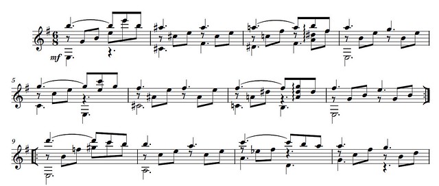
For example, here are a few systems from a little engraving comparison challenge that was going around a couple of years ago. I had done it in Finale so I just XMLed it over to Dorico
They are obviously different, but so much so that a librarian would complain about it? And these are just with my defaults in each, if I wanted I could probably match them even closer, depending on which program I was trying to emulate.
If you can post the Finale template the rest of the team is working from, we could probably give you some setting suggestions on how to match it more exactly.
(Yes, I know a lot of you will hate the winged repeats. I find them useful as most of the time the music I write will be under rehearsed, have subs on the gig, be in crappy light, and read by musicians who have already had 3 glasses of wine, so tough )
Thanks, Fred!
The librarian came back to clarify that what they really wanted for me is to make the score larger, which is going to be interesting as some of these pages are rather unfriendly to further condensing… but i’ll try.
as per winged repeats – I’m also a fan! I use them all the time, in all music, regardless of genre.
Interesting thread. Thanks, Fred, for your example. The differences are indeed there but surprisingly minimal.
As per winged repeats: I’ve realised how nonsensical my own reaction to them is. I’ve always had a kind of antipathy to them simply because I never see them in the printed music I’ve always used, but when I look through my own scores, most non-obvious repeats have wings which I’ve pencilled-in. It’s never too late to change one’s opinions!