If you insert say an accidental from Bravura into Word, it has very large upper and lower bounding box metrics, and this throws out the line spacing, and looks dreadful. While this is not exactly an engraving question, I guess many people use Word for prefaces or other text and this is an issue.
I need to insert accidentals for quartertones with arrows, so it is not really possible to find these glyphs in other fonts.
@Andro, since @dan_kreider might avoid “hawking his wares,” I can vouch that his MusicGlyphs font is very handy for this sort of thing, if purchasing a font is appealing to you.
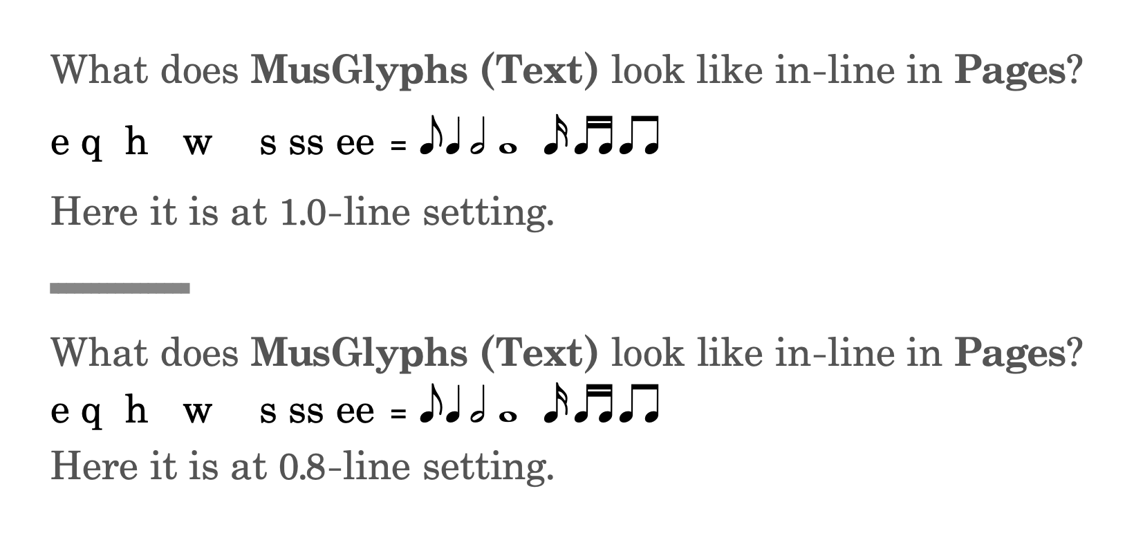
I don’t have MS Word, but in Apple’s Pages, Bravura won’t even appear as an option in the font list (I bet that could be tweaked), so I couldn’t readily try it. Here’s a quick example in Pages using MusGlyphs Text (for all of the alphanumeric characters) and MusGlyphs for the musical symbols:
Ah. Here’s the problem. Say you use Bravura Text, the glyph is so tiny you cant see it, and if you make it large enough to read, the line spacing goes awry.
IME, Bravura Text indeed does have the same issues. Dan’s suggestion of using Line Spacing: Exactly fixes this in Word though.
The catch for me is that Dorico doesn’t have a Line Spacing: Exactly option like Word, InDesign, etc. Since Bravura Text is covered by the SIL Open Type license, I just created my own version of it that matches my font metrics exactly. So instead of this in Dorico with Bravura Text, where the line spacing is thrown off and wonky …
Roger that. I wonder if Dan would be open to a discussion about expanding his palette…. (Of course, I realize that there might be a readily and not-too-difficult available solution to get Bravura Text to behave.)