I’ve started the layout phase of a large hymnal. The music is all typeset in Minion and Bravura. I’m looking for recommendations for the titles, numbers, and section headers. Below is what I have: Minion for title/header and Garamond for the numbers. I would appreciate recommedations for other typefaces that would work well with Bravura/Minion. Thanks!

I’m a fan of Bodoni 72 Old style.
Minion has something like 58 styles and weights, so you could try one of the variants, like SemiBold Condensed, using a Display or SubHead optical size. Or you could both the title and the number in Garamond., though Minion and Garamond are both Humanist faces, and there’s usually a rule about not having two of the same ‘family’.
Alternatively, you could go sans for the headers: Gill Sans Bold Condensed, perhaps? Or Myriad, which works well with Minion.
I don’t think you want too much variety: bear in mind that you’re going to have to tie in the title pages, prelims and indexes to the overall design.
2 Likes
I second the recommendation to use a “Subhead,” “Deck,” or “Display” variant (“optical”) of Minion. That’ll look really elegant, both for its inherent design and for the fact that it’ll perfectly match the type in the music. The specifications that came with Minion should tell you which optical variant to use, depending on the point size you’d like the headings to be. (I turn off staff-relative sizing for header text, or else the rastral size multiplier might turn what I think is, say, 15 point font into, say, 12 point, which would require a Book or Text variant instead of Subhead.)
Mixing types of the same family so often results in a sort of uncanny valley: “Wait, are those supposed to be the same?” If you can find a Garalde that harmonizes nicely with Minion, but keeps its distance, you can “break the rule.” The trouble is that all the ones I’m thinking of have too much flair for a simple heading of a single page of music: Canada Type’s Ronaldson, Hoefler & Co.'s Requiem, FDI’s Tierra Nueva. Maybe Goudy National (by Matteson Typographics), which makes me drool every time I see it, could work, but it doesn’t have a titling variant that I know of, so it would look like chunky book text under a magnifying glass at header sizes (like most fonts without subhead or display variants).
You might also experiment with caps, small caps, and letter-spacing for more “flavors” to the headings.
Lastly, it’s worth saying that Bravura has a warm, heavy, hand-crafted feel to it, so I’d avoid anything on the other end of those spectra, which (to my taste) includes pretty much any sans serif north of ITC Legacy Sans.
Oh, one other recommendation: you might have luck with Adobe’s Jenson Pro, Subhead. I once paired it with lyrics and staff text that was set in Arno and it wasn’t a bad match. Jenson’s hard to beat for personal warmth and character.
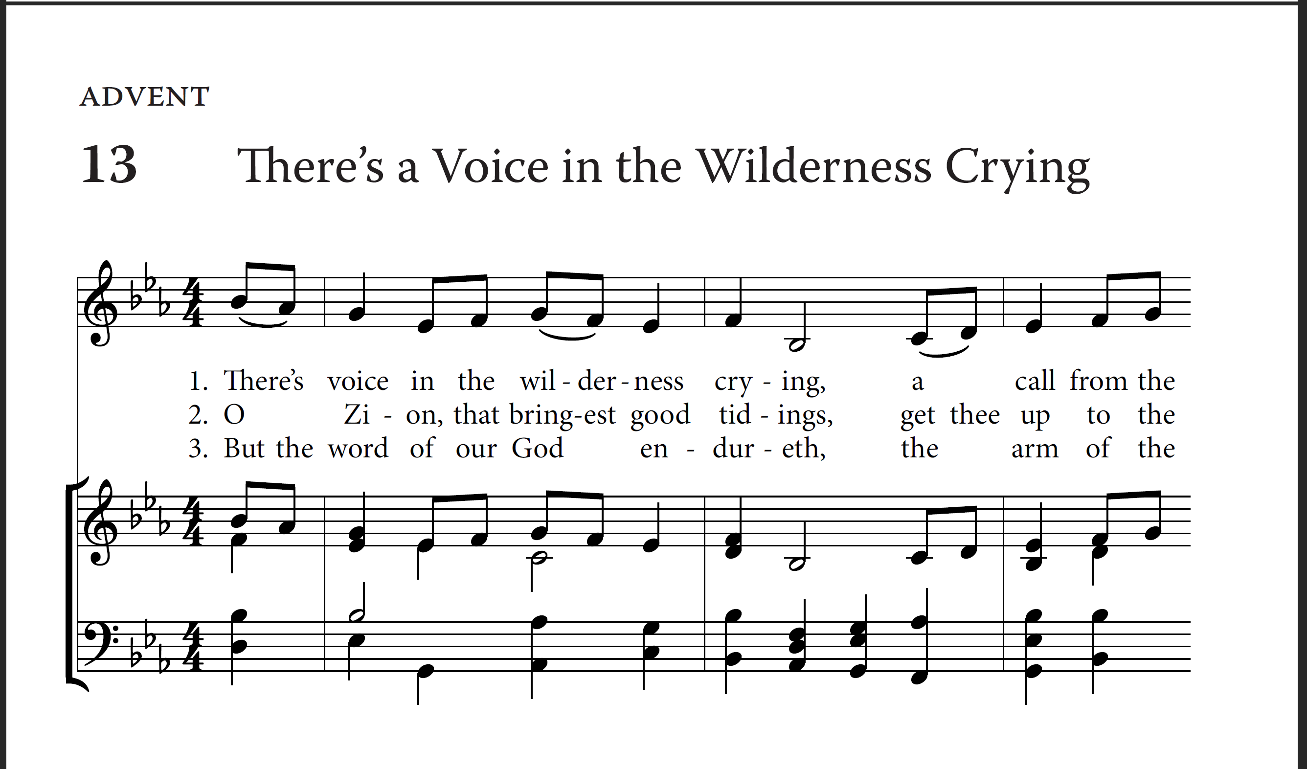
Thanks for the recommendations! The first draft was due yesterday, and I ended up using Warnock Pro for the titles, topic, and number. I think it turned out pretty nice…
@DanKreider
The title doesn’t match the first two words of the lyric?
2 Likes
Good catch!
Ach, how embarrassing. In my defense, it was a mad dash to get the draft to the committee, and editing went out the window until the next round. Still… yikes. ![]() And thanks, I shall pull out the tape and scalpel.
And thanks, I shall pull out the tape and scalpel.
Oh, nice! I forgot about Warnock. It’s a gorgeous typeface, and probably not so close to Minion that it’ll look odd.
Personally I think all hymn titles should be set in Grusskarten Gotisch.
I somehow thought I was the only person in the world who likes to use Warnock. ![]() It’s not used as much as I would have thought. It’s a superb typeface, designed of course by Robert Slimbach. Warnock’s son commissioned it in honour of his father. A characteristic of Warnock is Slimbach’s ligature for Th, rather unusual, which. coincidentally, you can see in your example. I think your use of it looks great.
It’s not used as much as I would have thought. It’s a superb typeface, designed of course by Robert Slimbach. Warnock’s son commissioned it in honour of his father. A characteristic of Warnock is Slimbach’s ligature for Th, rather unusual, which. coincidentally, you can see in your example. I think your use of it looks great.
1 Like
That’s great, I didn’t know Robert Slimbach designed it! Makes sense. Someone suggested it on another forum and I instantly liked the look of it. Formal but not stuffy.