It occurs to me that, depending on your anticipated market, you might also switch the score page size from A4 to Letter (or your preferred US size). Factory default paper size is dependent on the Default Paper Size type setting within Preferences, which knows that I’m in Europe (geographically, at least!).
Makes sense. I was thinking, though, that non-Pro users are going to hit a wall pretty quickly. This font does pretty well with most things out of the box, but some manual adjustment is pretty much inevitable. I don’t know…
For example, deselecting “Make space for lyrics” might cause some RNA to collide, especially if there are slashes involved. But if you re-select this option, you can’t properly draw extender lines.
Forgive me for not having actually installed the font here - it’s been a busy couple of weeks!
Did you mean to set up that file to use MusGlyphs for Lyrics? At least here, it’s not showing the Missing Fonts Dialog and all the lyric Font Styles seem to still be Academico.
(A suggestion: maybe allocate MusGlyphs as the Lyrics Translation font; that way SE/Elements users should be able to use MusGlyphs and real lyrics within the same project.)
Might there be no issues when adding symbols for the voice player?
What does happen when a part needs lyrics, Roman numeral analysis and functional analysis?
That’s what Leo mentioned above. Set the lyric font to display the lyrics, and the lyric translation font to MusAnalysis. This analysis font will display both types of analysis.
Now, if you need lyrics, translation, and analysis… you’re in trouble!
I have not yet installed your font, but it sounds a bit confused for me.
The best would be that Dorico provides a built-in methods for analysis.
Dorico developers could integrate your font…
It’s really not difficult to use. Just type in most of the analysis symbols as simple lyrics. And if you need “real” lyrics as well, make this analysis font be the font for lyric translation, and it will appear below the “real” lyrics.
Yes, Dorico needs a native analysis function. But the varying conventions make it incredibly complex, and creating this font has shown me just how difficult it is to accommodate all these symbols and variations. When Dorico adds a feature, they intend it to be comprehensive from the start. But I have the luxury in this font of just saying “This is what it is presently, nothing more.”
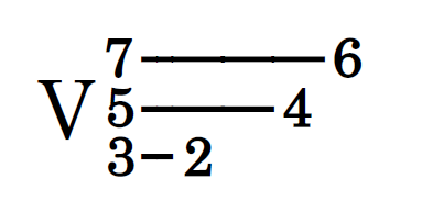
For example, take voice leading lines that resolve at different rhythmic positions:
There’s not only the challenge of creating the functionality, but presenting it in a way that doesn’t leave the user scratching his head. How would you design a user interface to produce this sort of thing? I have no idea what the “perfect” functionality would be for this.
I’m not a developer, but I can recognize just a small part of the challenge. So in the meantime, this font is intended to fill the gap. Yes, it has some syntax that takes time to learn, but I tried to make it as straightforward as possible.
As to the last bit… it’s actually I who have integrated their font, since most of these glyphs are copied directly from Bravura and Academico. I just moved them around and assigned key combinations to them!
I sincerely appreciate you! I will try to use it when I have time for it! Thanks!
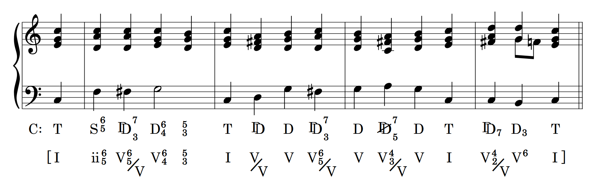
Just one thing to say is the diagonal line of rootless dominant symbol for functional analysis. Could the direction of the diagonal line be like the diagonal line of subdominant dominant?
Do you mean the fact that the angles of the D slash and S slash are different?
Or do you mean that it uses slash key instead of backslash? If it’s that, the reason is because a double backslash in Sibelius triggers some sort of context thing (or so I’m told), so I wanted to avoid the double backslash.
As far as I know, the angles of symbols for the D without root and the S without fifth are the same “/” before digital publishing has been popularised. The angle used for s in your font is the standard symbol for shortening (or reduction; Verkürzung in German).
With the advent of digital publication, there have been several variations of symbols.
I think in any case, the angle of slash for shortening should be unified in one publication or one of the publication series.
I hope it could be reflected.
Could I personally change the "" for “D” into “/”?
As an illustration of alternate traditions, what you label a V 6/4, I would have labeled a I 6/4 resolving to V. Things must have changed in the past 55 years.
At least I now know what that figuration meant in your earlier examples. I was thinking a V 6/4 resolving to a 5/3 would give a supertonic over the initial bass note.
(Do the slashed D is a dominant without the root, an alternate way of writing VII?)