A quick mockup of three approaches that Steinberg should consider.
This leans towards Ableton Live’s approach.
Leans towards Studio One’s approach
Leans towards Adobe Audition’s approach. They increase the brightness of the background and add a white border.
For the first two, this means the cyan color would need to be removed as an option for users within the preferences.
Note: these examples don’t address the complexity of the issue though. There’s still a lot more that has to be factored in such as transparent events, waveforms colors, etc.
In general, I think most UX people would recommend against the user “customizing” the selection color individually. It’s unnecessary. That’s why Steinberg’s approach has become so breakable. They allow for so many user customizations that complicate factors of contrast and readability. They allow us, the user, to break things very easily.
Adobe Audition
Here’s a screenshot of how they handle. This demonstrates the contrast better.
Exactly. This is why it’s a complicated factor. A white border will not work with a light background. This means the user should not be allowed to select both a light background and a white border.
In a lot of modern software, the user only selects a theme and the theme organizes a collection of colors with proper contrast. So if you needed a “light theme” that preset could include the following:
A light project background color
Some specific high contrast selection color (not white, something else)
[estevancarlos]“This means the user should not be allowed to select both a light background and a white border”
Seems logical…from a programming perspective I imagine that would need a well thought out scheme with some clever interaction between values which push/pull against each other and subsequently avoid GUI elements being hard to see?
It can be much easier. The common approach today is developers will create preset themes that contain the correct color arrangements. So a “light” theme will automatically contain the correct, higher contrast “selection” color within that theme. In terms of programming logic, it could refer to a list of values such as “background-color, selection-color, focus-color, etc”
Interesting how we had this discussion, but the other way around a couple of years
ago:
Then they introduced the option that let you choose between either the inverted style or the red outline in N12 and N13 and everyone was sooo happy. And now this option is gone again. I totally understand the frustration (even though I’m team inverted) It seems surprisingly hard to get this right.
The discussion has always been there.
Cubase users => against the red outline, in favor of the inverted style
Nuendo users => Highly opposed to the inverted style, unconditional support for the Red Outline.
Thank you @RobL for linking that older thread.
I was oblivious to this complaint about the red border, it never occurred to me it would also be a point of contention.
After reading the whole thread, I kind of understand Fredo’s first few comments here about the technicalities and what was said makes much more sense to me now. However, I can’t help but raise the point that in the other thread you were a strongly against inverted colours saying yourself along the lines that changing colours of events is a big no no for people in post production. Here you initially said this (what we have now) is “the best compromise”. It baffles me that this is considered a compromise… giving us the ability to turn on and off the outline, but not the inversion.
I have seen many people in the other thread and this one, not to mention all the countless people who do not frequent this forum (probably many hundreds more). We are opposed to the inverted colour method, reasons for which I and others have described in length. The main disagreement is with the way this major workflow upset has been “forced” upon us, from what we gather is due to Cubase users tastes primarily.
I’m sure i’m not alone in saying that despite using Nuendo 14 for a good while now, I still am not used to to inverted selection colour it messes with my concentration a lot and i’m seriously considering dropping my decades of patronage for Steinberg and moving to Reaper. I am not averse to change usually, but this has kind of crossed the line for me personally.
Steinberg need to seriously consider a way to make it work for us to have the choice. For everything else graphical we get the choice, but for this having an option to disable inversion and leave the outline is somehow deemed impractical from a technical point of view and low priority from a resources POV.
I really hope that this can continue to be a consideration for the development team; that a vast number of Nuendo users are unhappy with this and cannot just “get used to it”.
Wouldn’t it be possible to make the outline a light colour when the selection is made and the colours are inverted?
I believe a lot of the rejection from Nuendo users come from the fact that when the color inversion happens, the outlines disappear. That makes some textures to be lost when zoomed out, for example.
I think that even if you can’t not invert the colors, also inverting the outlines will go a LONG way.
Here you touch the second “problem”.
Many users have a very personalised (and extreme) color setup.
I really can’t understand why people use bright colors that burn your eyes within hours.
I also don’t understand why people tone everything down so everything is deep-dark.
99% of the problems are due to the stubborness of users. “I use Red for my vocals, so the Red Outline breaks my workflow”.
I personaly don’t like the inverted color at all, but within my color scheme it is managable.
There are a gazillion things that I would like to be different in my beloved Nuendo, but none of them has even stopped me from doing my job. If something didn’t work, then I looked for a solution. It never will, be, and never can be, ideal for everybody.
So make the best of it.
I honestly don’t get your point - or at least don’t see how it is related to what I said.
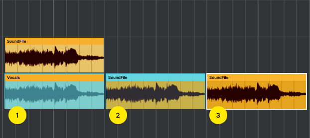
I have always used the colour scheme as it comes from the factory. I don’t change any colours at all, and I have noticed that the outline of the waveforms vanishes once the event is selected. And I have also noticed that in certain zoom-program combinations, it is the outlines that give some detail.
And lets be honest, regardless of inversion/no inversion, losing the waveform outlines when the event is selected is something that doesn’t make much… sense? What’s the logic behind this choice? It seems to be a bit deliberate. And for those that want no outlines, we already have a slider for that.
Why not keep it logical, and invert the outlines as well, for example?
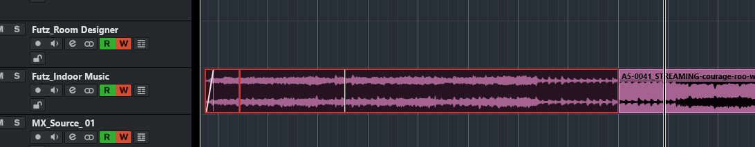
(Note, Background Color Modulation is selected on mine)
The “red line” can just be turned off in Event Display by unchecking “Highlight Borders of Selected Events.”
I’ve been following this thread with some confusion - I think it’s beautiful, personally. I figured I just misunderstood something because folks seem to be really upset about the “red border” but you can just turn it off. I like it, but I’ve been keeping out of the “personal” part of the thread.
This doesn’t work, because the outline intensity is not a “dark>bright” slider, and more like a “opacity” setting for the outline. So in whatever position it still disappears when the event is selected.
Just to be clear, I don’t mind the color inversion at all, I’ve been using it for a decade.
I’m just trying to help build a solution and improve it.
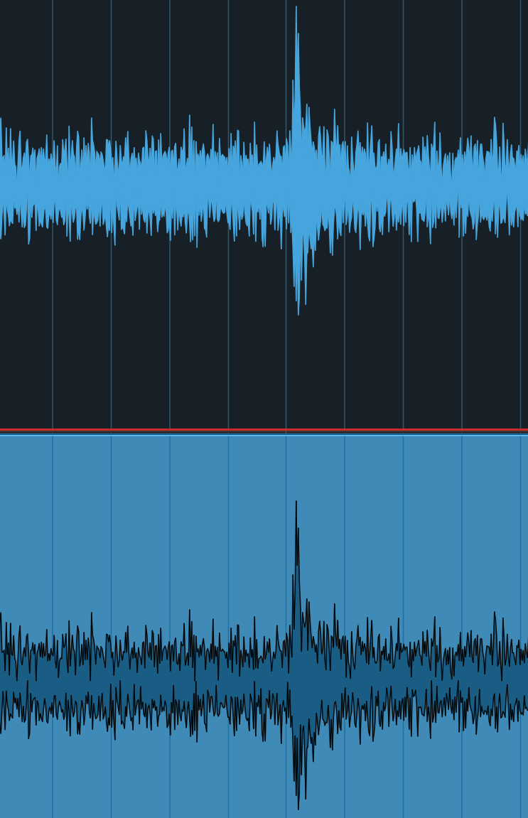
your exemple shows the lack of an “outline” in the selected event, as far as I can see.
To me it absolutely clear that when selected the waveform has no outlines, going from one solid color to another.
It is also blatantly obvious that several details in the unselected waveform were provided by the outline and are missing from the selected event.
Sorry, I misunderstood based on what I saw in your video (which was that color scheme making the entire waveform representation become very very light). I now see you were talking about the outline.
Sorry. I’m back in Lurk Mode as I don’t understand the issue.
Well the information that is missing is details in the waveform. You may think that’s irrelevant, but it is what it is. Details are gone, that is a fact.
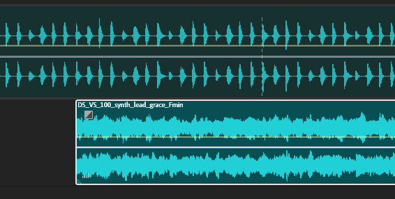
I’m not being stopped by anyhting with this view. I’m simply noting that the lack of an outline changes the overall texture and shape of the waveform (since the space occupied previously by the outline is now taken by the same filling of the waveform), and that has been one reason why a lot of users are complaining.
A few posts back I myself was struggling to understand what was so bad with the colour inversion. I believe this is one of the reasons. The waveform is inconsistent, even if subtly, between selected and unselected events. I can see now how this can be disturbing for some users.
And I must say I believe I would indeed prefer if the outline was kept and simply changed color when the event is selected.