Hi all, just took the promotion for Finale users, after 20+ years I think it was time to try out something different.
I’m in the early stages, watching tutorials, reading online help and exploring the menus and options.
I must thank Dorico for the excellent translation into Spanish, never seen before in a musical scoring software. There are some places where English terms are still in use (should one report those instances?)
Quick questions:
Can ledger lines thickness be modified?
Can ledger lines, ties and slur tips be rounded, like other objets such as articulations? (sure, this is noticeable only at high magnification)
I’ve tried several setting for beaming, saving them as defaults, but I still encounter many cases in which a manual tweaking is necessary. ¿Have the developers thought of implementing some kind of learning curve for items the user manually changes more often? I always dreamt of such a feature in Finale, mostly for beams and slurs…
Looking forward great scoring!
Felipe Copaja
Dorico 3.5.10
Macbook Pro Retina (2012)
Valdivia - Chile
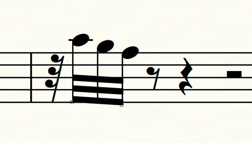
This is one example that can’t really be done in Dorico. Dorico either has default gap between beams or the widened gap where all 3 beams follow the exact same sit/straddle/hang settings:
Ideally I’d like to see a semi-widened gap so the outer beams aren’t using the same sit/straddle/hang rules, and the middle beam has a 1/4 sit or 1/4 hang setting. Something like this, which avoids all wedges:
It’s very easy to change the beam angle in Dorico, but impossible to customize the gap between beams, other than the settings in Engraving Options.
Allowing you to change the thickness of the beam lines and the gap on a per-beam basis is something we plan to allow in a future version of the software.
I second your second question, Felipe – might I suggest to the team that it in my opinion it would be really beautiful to have ever so slightly rounded ledger lines, beams, stem ends, etc. I absolutely love the inky rounded warm aesthetic you achieved with the Bravura font, and I find the computery right angles in other visual elements to clash with them. I know it’s subtle, but I think it would create a really nice look.