Octave slurs; something inconsistent?

teacue, please read the whole of the thread. The example you have posted is what instigated this discussion, before it devolved into an inquisition into line thicknesses and shoulders. The pictures I have posted are indeed default slurs, but following the fix described in post #8, which of course is not available outside of our four walls at the moment.

:blush:
Sorry for the noise!

John, if you see this and are able (and it’s not too OT for this forum), can you post some published examples of what you consider to be “ideal” slurs? I had modified my Finale slurs and ties probably 20 years ago to try to match SCORE’s as close as possible, but now that I’m really investigating minor tweaks to Dorico’s, I’m curious what you and others currently consider to be good examples.

Hi “Fred”.

Here is the example above in Finale with my settings. Actually, I was surprised at how close this was to Daniel’s last example, but the fullness in the middle and the degree of taper makes all the difference to me. This was something that I couldn’t achieve in Dorico, but that doesn’t mean that it can’t be done.


Here is a longer example using my settings. Both of my examples would appear thicker on printing.

Here are nicely hand-drawn slurs from the Bretikopf and Hartel Complete Works of Brahms. Notice the “belly”:

I had trouble scanning the following examples from Henle and Wiener Urtext, but at least viewed from a distance one can see the general shape.

I placed them in the next post:

Wiener Urtext and Henle
slurs Wiener Urtext.jpeg


There were several threads devoted to slurs at Notat.io several years ago.

Thanks! I’ll check there too.

John, your examples are indeed lovely.

Thank you very much, Romanos401!

So I finally got around to working on fine tuning my slur and tie settings. While trying to recreate some of the examples John posted, I ran into another setting that either isn’t quite working right, or is in conflict with a different setting. If I recreate his Brahms example using my current defaults I get this:

All slurs above have had no manual adjustments. The endpoints are vertically a bit farther away from the beam than in his example so I tried modifying Slurs/Endpoint Positioning/Vertical offset from beamed stem, and realized that I can increase the value to anything over 1/2 and see results, but anything under 1/2 doesn’t produce any change. It seems like there is a fixed “minimum distance between slur and beam” setting of 1/2 built in, but I don’t see any place to adjust that if I’d like the endpoints to be a bit closer to the beam. Adjusting the vertical offset to anything under 1/2 has no effect at all although obviously they can be manually adjusted. Is there another setting somewhere that is overriding this vertical offset setting?

There is another option, Minimum gap inside slur curvature to avoid collision which is 1/2 a space by default. The end point distance can never be smaller than this value, so you also have to reduce it to 1/4.

Ah, that’s it, thanks András!

I like your slurs, Fred! Very encouraging.

Thanks! There are a lot of pretty powerful slur settings. I had settled for “good enough” and had neglected to really dive in and tweak them, but I think I’ve now gotten them to a place where I’m fairly happy with their appearance. Still fiddling with a few settings though.

One more question/request … Here are two bars from John’s Henle example. The first bar has no manual adjustments, and the second has the start point modified in the left hand.

There are settings for Notehead side and Stem side, so my Stem side vertical adjustment setting is a bit of a compromise here as neither stems up nor down reproduces the Henle settings exactly. (I’m ok with this.) I do however much prefer the start point of the slur in the second bar though. There isn’t any default setting for this situation, is there? I guess I would be looking for both horizontal and vertical offsets for slurs starting from flagged stems rather than noteheads, so maybe a Flag side setting? If there isn’t any control for this situation already, I would definitely like to add it as a feature request, thanks!

Out of curiosity, would you mind sharing a screenshot of the engraving settings for these slurs?

(edit- I should clarify: I find these quite lovely.)

Agreed. I would also be curious to see Fred’s slur settings. I’ve partially adopted Daniel’s settings above, with a gentler shoulder offset for short slurs (2/5) but with slightly greater end (1/14) and middle (1/5) thicknesses. I find this a great improvement over the Dorico default but I’d still be really interested to see the settings for the lovely results above. I also second Fred’s request for a separate setting for slur ends at flagged stems.

Whatever those settings are, they or something very like them should be adopted as the Dorico default. It would lead to greater acceptance of Dorico as well as preserve beautiful engraving as we have known it.

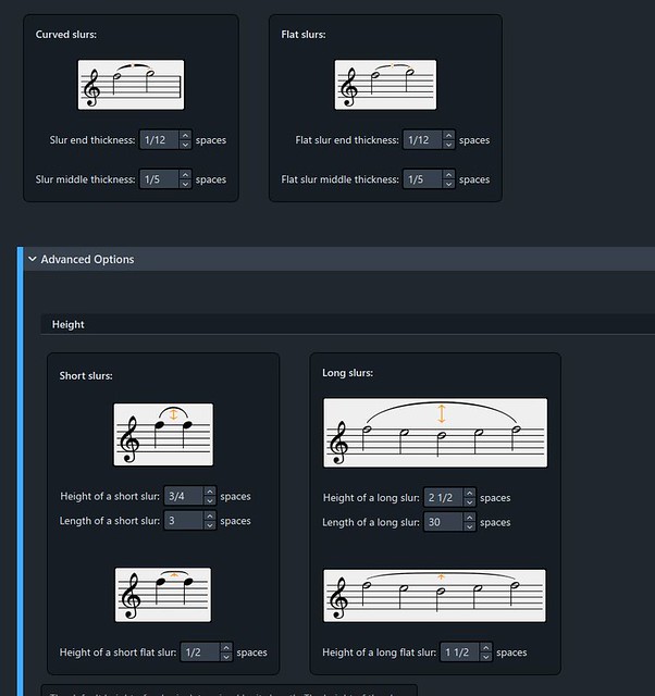
Sure, I’m still tweaking, but here’s what I am currently using. Most of it is just thinning them a tiny bit and adjusting the shoulders. I haven’t really used flat slurs, so ignore those settings.

3 Likes

I don’t see why not! And with the library manager, you could transfer those settings to any ancient file :wink:

1 Like

Here’s a file I’ve recently prepared. It’s a ‘Factory defaults’ file, except for changes to the following Engraving Options:

Beams
Lyrics > Hyphens
Notes > Stems
Slurs

Dorico Slurs and Beams.dorico (1.5 MB)

The slur settings are similar to Fred’s – as are the beam/stems, after discussion with him and others on the Notat.io forum.

I have made some other little adjustments, which I think improve things. Also, changes to the Lyric hyphens that improve spacing.

As always, particular music may need different treatment; but it’s a start. I may post this again in a separate thread.

8 Likes