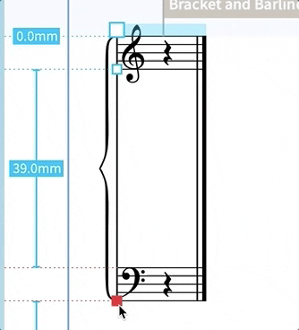
Lots of the piano music I’ve been using to try Dorico out has quite a big vertical stack in each system. This is often unavoidable but stretches the system brace like this:

Is there a remedy for this which I haven’t found? Thanks!
Lots of the piano music I’ve been using to try Dorico out has quite a big vertical stack in each system. This is often unavoidable but stretches the system brace like this:
You can stretch the braces in engrave mode. Click on one (there are little handles) and alt up or alt down to extend it.
Romanos, I suspect you’re missing the point. I can’t find a solution to this, though I note that different Music Fonts seem to give different results so there must be something adjustable behind the scenes.
Indeed I was. I’ve never stretched them far enough to see that happen. I thought the op’s screen shot was from another program. Maybe Dorico should offer an option to force a traditional brace rather than switching to the narrow brace after exceeding XX%.
Galambborong, you just hit a sticking point for much notation software. Ideally, piano braces would adjust their proportions incrementally since they tend to distort unacceptably when the staves are very close together or far aport. This is also a problem in Finale, but at least there the user can design their own brace to try find a compromise shape that will work in most cases. I use two settings, given to me by a very fine engraver, Wess, one for standard situations and another for extreme ones that also is acceptable in standard ones. While I think the Dorico piano brace is among the best, (although a little thick at the ends for my taste), I was disappointed to find that Dorico does not allow the user to design their own brace, which is a step backward rather than forward.
But perhaps I am wrong or this is now changed in Dorico 3?
The interesting thing is you can copy the curly brace into a text box and then change the width property to make the character narrower while still retaining its fundamental style.
You hit the nail on the head. It basically doesn’t like 3+ (busy) staves within a brace, which is unfortunate.
It seems the Edit Music Symbol does allow for editing this. It has 5 brace presets:
‘Brace’
‘Flat brace’ (This is the one shown in my example above)
‘Large brace’
‘Larger brace’
‘Small brace’
So I guess the aim is to force Dorico not to opt for the ‘Flat brace’ when the vertical height gets to a certain point. Or perhaps I could replace the ‘Flat brace’ symbol itself with the next most suitable of the pre-existing ones (larger brace’, most likely).
May play around with the symbol editor and see what can be done…
By users designing their own braces, I didn’t mean selecting from a list. Here are the adjustment possibilities in Finale. Is this degree of control possible in Dorico? When I played around with the Music Symbol editor in Dorico I could only change the general proportions of the symbol. I am not sure that is adequate to solve this issue.

Not inside Dorico, it isn’t. Dorico uses the above mentioned font characters for the braces. It selects and scales the one that it deems fit for the height of the system.
You can of course create your own characters and import them either by way of a custom font or as vector images.
I also find the Bravura character for large braces not really appealing.
Other fonts use other characters.
See the attached images for MTF-Cadence and MTF-Beethoven large braces (I made on my own a SMuFl version of Beethoven)
mtf-cadence

mtf-beethoven

Automatically selecting one from several is a pretty good system, but I must agree with teacue that the results are not appealing if it is the skinny one in the first example. His two examples are much nicer. A better approach would be to consider the piano brace to be something dynamic like a slur rather than a glyph or collection of glyphs. Dorico should allow the user to create such a dynamic brace or better several braces by means of numerical input within Dorico and then automatically apply scaling depending on the situation.
And creating a piano brace from scratch is not for the faint-of-heart. I designed my own G-clef and it took days of work to get it the way I wanted it.
Sure, apologies for the confusion. I was under the impression the symbol editor was a bit more functional than it is (still new to Dorico and learning what’s what). Good to see the options you get in Finale, thank you for sharing that - it’s interesting seeing the functionalities offered elsewhere.
Now you’re talking my language…!
Not sure I’d dare create one from scratch, but I am looking into importing the bits I like and/or have heavily customised from my SCORE symbol library. Not a straightforward task, though.
In any case, the other examples by pianoleo and teacue, look acceptable. Were these done within Dorico and with what fonts? And I’d be interested to see a Dorico brace with the staves very close together.
Both examples I posted were made within Dorico.
I used “MTF Cadence” for the first example and “MTF Beethoven” for the second example.
Both fonts have been created by Abraham Lee and are available at Music Type Foundry (but I am quite sure you know this already).
Only MTF-Cadence is available in a SMuFL version.
I did a SMuFL version of MTF-Beethoven on my own, which is BTW a quite difficult and time consuming task.
Thanks, teacue. Sorry, you already mentioned the two fonts. I didn’t understand pianoleo’s example and thought he was using two different fonts. I get it now; the Bravura is distorting like that at the specified range. Very strange.
Congrats on doing the SMuFL version of the Beethoven. Great job. I never tried to SMuFLize anything. Fortunately my G-clef imported into Dorico as a symbol.
Anyone care to share a shot of a Dorico piano brace with the staves quite close together? For example, with the bottom of a G-clef on the top staff touching the top of a G-clef on the bottom staff.

Excellent! Thanks so much, Derrek.
That brace looks pretty good.
(Now if I can only find an 8-handed keyboardist.)
Stephen, thanks for the example, but it is suffers from the same ailment as the one in the original post: it’s spindly. I suspect, however, that MTF-Cadence and and teacue’s MTF-Beethoven would do a much better job within Dorico. Teacue, could you show a really big one?
