Is there any way to achieve this in Dorico — a setting for dynamic appearance? There are obvious workarounds with shift-x text, etc., but it would be great to do this naturally.
Check out Library/Font Styles/Dynamic Music Text Font … but I think this requires a SMuFL font to work correctly. Perhaps there’s a hacky way to solve that. A workaround with Lyrics may be an option too as it would help with alignment.
Yes I tried this, but as you say, it only works with SMuFL fonts. It would be great if this were a setting, like the figured bass settings — “plain font.”
Certain publishers use this as a house style, and it would be useful for editorial markings. It’s also a popular aesthetic choice for contemporary composers and editions of early music. The NMA is just one example of many, so it would be great if Dorico made this easy.
Why? [If you are simply copying earlier publications, what is editorial?]
Such as?
Most 18C (but few if any 19C or later) publishers did indeed use plain font. Though I fail to understand why you would want to highlight the shortcomings of their technology, except perhaps as some kind of faux authenticity. Manuscripts of the time did not use plain font!
NMA - despite being Neuer is hardly contemporary! And why do you want to copy someone else’s style?
Doesn’t Baerenreiter use a Roman font for source accidentals, and italics for editorial accidentals? (Or is it the other way round… )
So you’d still need some method of dealing with the editorial accidentals. At the moment, we can use bracketed accidentals of course.
I’m not sure it’s a ‘good look’ – though other publishers have done similar. Novello used an Italic Slab face for a while, and OUP sometimes uses Plantin for dynamics, God help them.
As said, it would need this ability added to the program, like we have with Time Signatures and other notation.
Your alternative would be to make a font with those glyphs in the SMuFL positions.
In answer to the original question, you’d have to go into Library > Music Symbols and in the Dynamics category edit each of a dozen or more items to use a similarly-sized plain text glyph instead of what’s there.
@benwiggy, I remember you posted a really nice comparison of some examples of of text fonts for dynamics a few years back on another forum. Since it’s your file I’ll let you repost it here if you wish, but I’d be curious if your opinions have changed at all since then with the development of some new fonts (including your own).
I think the object of the exercise was to compare the symbols in the common music fonts, and to find a text font that matched the style, for things like sempre; but also as possible replacements. What I think it showed is that no living typeface comes close.
Ted Ross says " they are printed in boldface italic type designed exclusively for dynamic marks and are part of no other set or font of type."
I mean you could replace the G and F clef with Bold Helvetica letters, but … . to what end?
I don’t think that’s the end of the discussion, though. One could say the same about straight flags, for example, but the point is that whatever is the convention that is used broadly enough should be ideally supported. Convention arises from consensus. If enough people do a thing, it becomes a Thing.
Of course I don’t know how widely used this dynamic font thing is, but that should be the question at hand, rather than asking “what’s the point?“.
Though there also is something of a feedback loop: people won’t do a thing if the tools don’t cater for it; which may be because people don’t do the thing!
I concur that we need not pretend we’re still carving/stamping metal sheets (nor writing by hand…), and that software can open up exciting new possibilities: but tradition in communication is just as important.
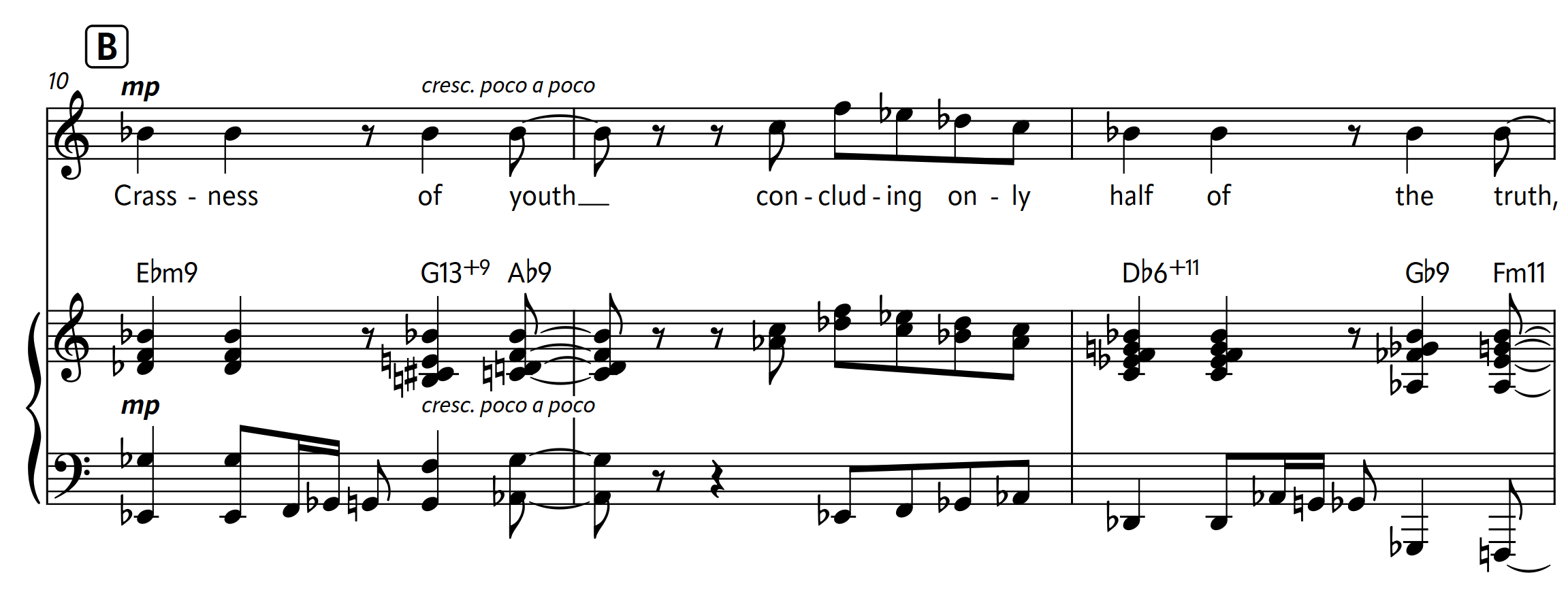
It’s entirely possible a publisher may even want a sans for dynamics, for example. This isn’t really my cup of tea, but it’s not unreasonable to anticipate that someone might want to do something like this: