This is a small request. But, it would be great to have a playhead in Cubase like other DAW’s have (especially for users coming over from Logic which has a more “grabbable” playhead at the top of the screen).
It would have a similar appearance as the screenshot attached. Thanks!
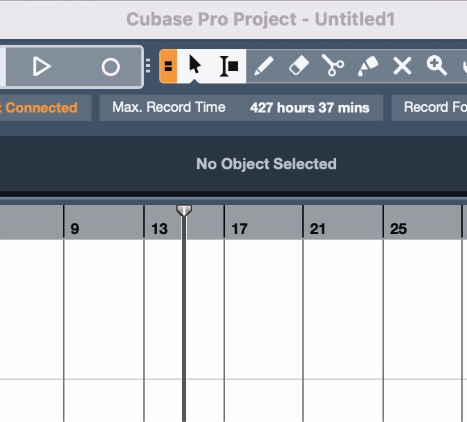
There is a setting in Cubase to let you use the upper area of the ruler (where the triangle is located) to move the Locator cycle around, respectively to draw in the Left and Right Locator. So your proposal would suggest you can grab the playhead but would perform quite a different action.
Doesn’t seem good UI to me.
That part would not change. It would behave similar to Logic in that above the playhead you would still be able to select and draw with the range locator. In fact, it would seem like it would make for a better defined area since you could see where the top of the playhead stops and where you would be able to draw a range.
Yes. Something you would be able to see and grab a little more easily. It would also allow the user to be able to see where you could grab and see a better defined area where the user would be able to “draw” for the range selector tool.
Logic has this ability and I find it easier to use and quickly drag the playhead around.
The cursor changes depending on where you are hovering it, so it already has this feature.
The grab area has the playhead as its center.
The range selector tool is something else. I suppose you’re referring to the Cycle Locators though. The changes You’re asking for would make Cubase more like what you are used to in Studio One and Logic, but it’s better for your workflow to get used to Cubase paradigms.
It’s not the same feature I am referring to. Yes, the cursor does change once you are up there and can scrub the playhead. I am referring to something more “obvious” like a Logic Pro has or other DAWS have with the playhead graphic at the top indicating you can actually click and drag it.
A couple of good examples of it being intuitive UI is:
Youtube. When you are playing a video, there is a small circle on the timeline. Intuitively, you know you can grab that and scan your timeline.
Davinci Resolve, Final Cut Pro, Adobe Premiere and most Video/Timeline editors, have an obvious playhead represented graphically that is easy to understand what it does.
There is a post that is on this thread where a person didn’t even know that feature exists. That should tell us all that it is not good UI/UX design. (see screenshot attached).
I love Cubase. I would just like it to be easier to use and grasp their workflows for new users coming over from very common interface elements. Small UI changes matter and can make a huge difference to the end user first trying out a system.
I know this means some users may have to get used to some new user interface changes. But, as long as they make it a setting that can be switched on or off, then, wouldn’t this be a good thing that would keep Cubase thriving in a very competitive market?
I did not know it exists, because I never needed it. It never crossed my mind that I need to grab a tiny line and move it around, I just click anywhere (with background click preference activated too), and it just goes there.
If I need to return again and again to a certain point, I just plop a marker there with the Insert key and Shift+B my way back there once playback has brought me past it.
Why fiddle with the mouse at all for transport duties, apart from a single click somewhere in the timeline?
I don’t doubt there’s an explanation for it, it just seems so… strange to me.