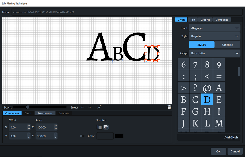
Using Alegreya font from Huerta Tipografica, I am trying to make note names with accidentals to label notes with extreme leger lines. But when I use A - G the size comes out different for each glyph, as follows:
Why?
If I just choose say A, it’s large, If I just choose B, it’s small.
I reinstalled the latest clean version of the font from the foundry.
And this happens when I have Unicode U+000 to U+FFFF range selected, as well as just leaving it at SmuFL.
Dorico 4.10.30.1060, Windows 10.
[Just running some tests with other fonts, the issue is not there. Perhaps some incorrect metrics of some type in Alegreya (which would be suprising as it is a very widely used font)]
