The gif says it all

The gif says it all
+1
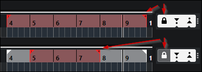
Agreed. If Punch-In is activated, that should be reflected in the ruler also when the the punch-points are locked to the Locators.
Now when the punch points are locked, it looks the same as if Punch-In is deactivated, although it is active. Confusing.
Even if the separate punch-point-indicators are removed because they are locked to the locator positions, the red line should be shown in the ruler to show that Punch-In is active, and the Locators could turn red - as suggested - in replace for the removed separate punch indicators.
yes and further, it can adapt based on what parameters are active:
Loop and Punch In/Out locked to Locators

Locked to Locators active with only Punch In

you get the idea
Bump
anyone know if this was added in 11?
I have Cubase 11 but it is still as you show in your images.
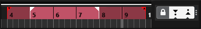
When the lock icon is ON the red up/ down arrows disappears.
Personally I would draw it like this
Your example works within that specific example, but the only problem is that the Punch In/Out points are not always within the locators as shown in your second graphic (with Lock to Locators disabled), and thus, one would not be able to differentiate visually. ie If you remove the project locators from your second example, it looks exactly like your first example.
Yeah well like this would still be visible though
Also if they would extend the lines like they did for the markers so that they are visible in the grid (as a preference) it would still visible
I would have to still refer to my previous examples I think, imo, they are more clear and defined and allow for the combination of Loop Cycle. Also, prevention of Punch In/Out Locators, and Project Locators from being lost into each other.
This is a good idea
Well it was just a personal suggestion. In any case the problem is not the graphical representation is just the feature is not there at all.
Yes exactly, the way the graphical representation just disappears is a fairly big annoyance as the transport icons aren’t very noticeable.
I routinely accidentally punch-in record when I didn’t mean to because of this graphical miss-design. Or worse, accidentally punch-out when I intended to keep recording a certain length.
Stop being violent and punching stuff ![]()
No unnecessary punching here, I have a rotti. ![]()
Another small but very useful improvement…
The graphic examples by @vncvr at the top of the thread are almost perfect, except that it would be better if the horizontal punch-line is shown just half red - half grey, or half red/purple - half loop-blueish (i.e. exactly as now, when unlocked) (instead of entire red or entire loop-blueish as in the graphic examples. Because when in loop mode, otherwise there’s no horizontal red punch-line = less visual indication).
Which means: they don’t need to change that horizontal punch-line (just show it also when locked). And turn the locators red (where applicable), in exchange for the removed punch-points when locked.
Probably they removed the punch-points because they are not movable when locked - but the punch-points are not just there as drag handles, they are at least as much there as visual indication.
So, if they don’t want to bother with this, it would be better if they just show everything exactly the same when locked, as when unlocked (instead of just removing all punch indications in the ruler).
So, it would look like this.
With both Punch-points locked to Locators, colored red (non-loop mode):
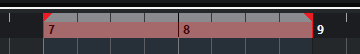
With both Punch-points locked to Locators, colored red (loop mode):

With only Punch-In active and locked, it will look like the graphic example 3 by @vncvr at the top of the thread.
Or alternatively, it could just be shown exactly the same when locked as unlocked. Although there would then not be any visual indicator in the ruler that the Punch-points are locked - so the shown examples above are better. (Still, also that alternative is better than showing nothing in the ruler when locked, as now).