I am trying to get a good appearance for jazz chord symbols in Dorico 3 and encountered some problems.
Most projects I am doing are jazz, where I like a handwritten appearance, so I set the Music font to Petaluma which automatically sets the font for chord symbols and their extensions to Petaluma Text or Script.
However, there seems to be something very mixed up. When I enter chord symbols with accidentals they seem extremely large, especially the sharp symbol. Furthermore, the sharp symbol looks different than the sharp symbol from Petaluma.

- Why isn’t the Petaluma glyph chosen when the font for chord symbols is set to Petaluma?
When I doubleclick the symbol in engrave mode to edit the appearance and then select the accidental I have several choices, the second seems to be the Petaluma variant.

2. Why is there no indication what font is used for the glyphs already present?
I choose the third (preselected) variant and doubleclick the sharp symbol to open a new editor where I can exchange the glyph for another.
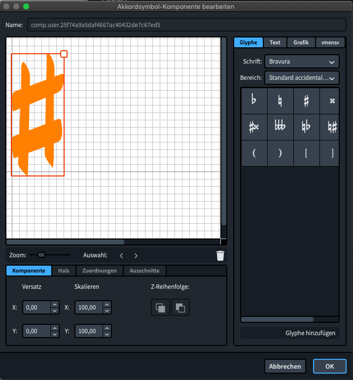
3. Why is in the panel where I can select the glyphs I want to add Bravura the preselected font for all categories although the chord symbol font is set to Petaluma?
-
If the font size of the sharp symbol is intended that way, I would like to change that. But it is extremely uncomfortable to change that for every single chord (not only every root, obviously). There must be a way to give the user more control about single aspects (see also next point)
-
In the engraving options I can set the amounts of scaling and offset for super- and subscript components, alas only for all of them together. I would find it extremely desirable to get access to the following components separately:
- root accidental (preferably independent settings for b/#)
- first interval after root
- other intervals/alterations
For example, in the G13b9 chord I would like to have the 13 in superscript, but still in a larger font size than the following b9 alteration.
One specific problem:
I want to enter a C6/9#11 chord symbol. Dorico turns that into C6#11add9, which I would consider wrong or at least bad practice. I can override that by editing the appearance, but again it is very annoying having to do that for every possible root.
While I understand the idea behind the chord symbol preferences I would welcome the possibility to sometimes choose differently without creating a completely new exception. For example:
In the settings I can chose for a maj7 chord between different text representations (ma, maj, j) or the ∆ symbol. I then can chose the vertical position of the text and the triangle independently. So, when I set the appearance to maj7, Dorico would still know how I’d like to place the triangle. Same goes for other chord types like diminished, half-diminished and sus.
In my opinion, Dorico should follow the settings when I enter chords with a midi keyboard, but when I enter a symbol via the text popover Dorico should try to stick to what I entered. Maybe one could cycle through different representations like one can already do with chord diagrams.


