Just wanted to know if anyone shares some impressions I have about WL7 design?
I think functionally, it is superb and does a very good job, but the onscreen icons and menu layouts just seem really clunky and old fashioned? Or is it me? I don’t think the icons work pictorially - they seem vague and over complex?
The small menu icons in the top bar are also really fiddly and densely designed, they look undefined, difficult to distinguish? The speaker and search icons are like something out of Windows 3.5 (remember those days?)
The floating toolbar also looks really fuzzy and clunky. It doesn’t really invite clicks, I always find myself hovering over areas to make sure they are what I think they are? they are not intuitive or that helpful as designs?
It almost seems that icons are ‘scattered’ about the screen, rather than appearing in useful positions. For example, I have a single W icon stuck in the centre of the screen for some reason? It does nothing that I can discover. Then some mysterious looking small screen design icons top right. They do things, but is it really necessary to clog up screen space with them?
Finally, I use WL7 a lot, and nearly always find myself thinking, when selecting menu items; why the hell is that item not included under that section? For exampe, why is Silence (Advanced) under Edit and not Process? That always catches me out.
The recent WL7 update seems to have added some ‘colour’ to things, but nothing that actually makes the onscreen presentation work for me?
Just an aside; how the hell do you get the transport bar with the start/stop/pause buttons to float in its own window?
I don’t think the icons work pictorially - they seem vague and over complex?
There are more than 400 icons in WaveLab. I agree there is always room for improvement, but with some many icons/functions, it is less easy to make them very distinguable (compared to simpler application that rely on much reduced functionality). This being said, the vast majority of icons has been redesigned since WaveLab 6.
The small menu icons in the top bar are also really fiddly and densely designed
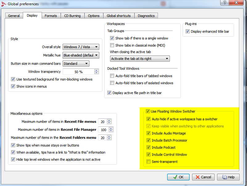
It might be usefull to enlarge the icon size with the following option:
The floating toolbar also looks really fuzzy and clunky. It doesn’t really invite clicks
Which one?
For example, I have a single W icon stuck in the centre of the screen for some reason? It does nothing that I can discover.
This is a passive indicator, to let you know quickly if the empty workspace is of type Audio File, Audio Montage, etc…
Then some mysterious looking small screen design icons top right. They do things, but is it really necessary to clog up screen space with them?
If you mean this, there are not useless. They are shortcuts to split the window tab areas.
For exampe, why is Silence (Advanced) under Edit and not Process? That always catches me out.
The design reason is that “Process” functions are for functions that “process/transform” samples. Silence functions are apart.
Just an aside; how the hell do you get the transport bar with the start/stop/pause buttons to float in its own window?
Right click in the Tool bar handle, to access the following menu:
this is purely from my own users point of view. I know when I am working on a music track, I get an idea then want to process it quickly and easily - my experience working with this version of WL7 is that I keep pausing, stopping, searching and double checking. There is something no very intuitive pictorially.
The top icons, while better larger, don’t explain what they do very well? Similarly, the big floating icon bar (it has the W symbol on it). The images just don’t explain anything, just pretty patterns really?
anyway, I was interested also in what other people feel about the design.
The search and speaker icon in the top bar are REALLY old hat!
There still isn’t an Audio CD Report output to .txt or .rtf
It’s difficult to resize things compared to WL 6. If I wanted to resize a Wave window to make it almost fill the screen to do Spectral Editing in WL6, I could just drag the top edge to almost cover the “peripheral window” tabs above it, and then drag it back down when I was done with it (or use shift-a and shift-q). But now the Wav window is constrained by the tabs window above it (can that constraint be removed?), and hence not nearly as useful for Spectral Editing unless I change Workspaces. But I don’t want to change Workspaces, or have to work on multiple monitors. I’d like to do this on a 17" screen or a notebook. I also miss the “Close All” Wave, Montage, etc windows.
I’ve never gotten used to the new look of the Master Section. At first I just thought it was just too wide, even at it’s least wide. It definitely is too wide in multichannel. The old one was fine.
For resizing windows inside a workspace, I advise you to make an alternate workspace that suits your needs for a particular editing session, and save it as a preset (and do the same for your default workspace). Then you can toggle quickly between two different layouts, even with a shortcut, if needed.
I also miss the “Close All” Wave, Montage, etc windows.
Thanks PG. I can get used to all of that. What I can’t get used to is no Audio CD Report .txt or .rtf (one or the other, I don’t care). I don’t even care what it looks like as long as it has all the data, without having to go through conversion from html or pdf.
I have noticed, using WL7 that the floating bar with 4 icons in it (including the close WL icon) seems to persist and remain on screen over other windows programmes. I had WL7 open and the floating bar is visible, then I opened Cubase 6 and noticed that even with WL7 minimised and all other menu screens closed or minimised, the floating bar remains visible across the Cubase screen?
I am using dual monitors, which may be the culprit?
It also does not seem to have an option to close it anywhere I can see?
I personally don’t like one screen designs, I have a 3 monitor setup (2 editing, one tv picture for Nuendo)
When I open the audio restoration/click detection or batch processor tabs I get little tiny stamp sized excerpts of the information I want while the second editing screen shows my desktop. That’s GUI design from hell . All other apps I use remember where the window I want was last opened and which size it had, so it’s generally a matter of pressing the key command to open the window I want and moving the cursor there.
I used to think to myself that it was a matter of time it takes to adjust to the workflow…
When I open the audio restoration/click detection or batch processor tabs I get little tiny stamp sized excerpts of the information I want while the second editing screen shows my desktop.
I also find the GUI and user experience to be a bit clunky, and I’m not a fan of the overall skin+icons. However, that’s certainly secondary compared to the functionality, which is why I use WaveLab in the first place. There’s nothing else out there that does what it does with the level of power that it has.
But if I were looking at it purely on a GUI level and user-friendliness level, it wouldn’t score as high as it could. It sort of reminds me of a “CAD” program for audio… it seems built for engineers primarily. But even we technical people could use a little more interface love. A lot of advanced software now has finally come around to the idea that the user interface experience is important and worth more investment of resources. I have a feeling that an interface facelift could improve sales too, to invite new users into the fold.
Good ergonomics is good economics.
So I do wish that at some point PG gets a new designer to do an ergonomics and beautification revision to WaveLab to give it the GUI sexiness and smoother user experience that it deserves.
I have been saying this for years on this app. And even with all the hype of WL7 coming down the pipe - the long and short of it is - the UI is still stuck in 1998. Whilst there has been some cleanup attempted - there is still no reason for the ugly toolbars, icons and especially the endless windows that complicate this application.
I have been in 7 since launch, have purchased the ASK video series on WL7, studied it at length and for the life of me - still do not get the workflow, get into the spirit of the workflow or even understand how this was designed with professionals in mind. I just plod along, using a module at a time and hoping all the while that I do not click on something that will ruin/replace/repurpose my current windows layout so I have to start all over again.
Bottom line - when comparing the elegant clean and extremely function designs of Cubase/Nueudo to Wavelab - one could scarcely realize that they are sold by the same company.
And finally - while I continue to praise PG’s work on the actual audio processing/functionality in WL - he seriously needs to let the reigns go and let some real UI designers (ala Dave Nicholson et al) take over in the UI department. This current design is just another example of multi window madness…
You have put your finger right on it - how can one company put out such completely opposite design qualities as wavelab and cubase? - the first so clunky and antiquated - the second so neat and visually pleasant to use?