Some thoughts on lyrics and spacing

I’ve been thinking a lot about note spacing when lyrics are present, and how that could be improved.

To me, both for the sake of aesthetics (relative) and sight-reading (more objective), it’s important that note spacing in a bar be somewhat proportionate: that is, steady quarters should all be the same spacing, and a eighth note doesn’t need exactly half the spacing of a quarter note, but it certain shouldn’t have more. Furthermore, I tend to think of these relationships within a bar: depending on the width of the lyrics, some bars need more space, and some need less, but inside a bar, the spacing should not obscure the rhythm.

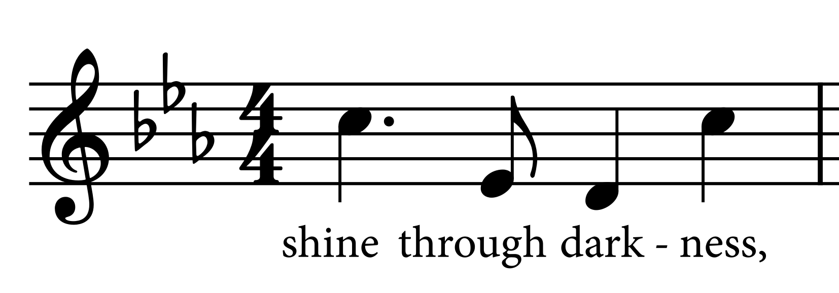
Typically this is mostly a matter of horizontal lyric offsets. In this example, which took quite some time, besides some slight note spacing, I mostly just added horizontal offsets to the lyrics.

Of course it’s not just hymnals that need lyric offsets. All vocal music needs offsets from time to time if decent note spacing is to be achieved. Here’s an example with some note spacing applied to avoid disproportion (that is, the dotted quarter being at least longer than the quarter, and the quarter longer than the eighth). First, the default:

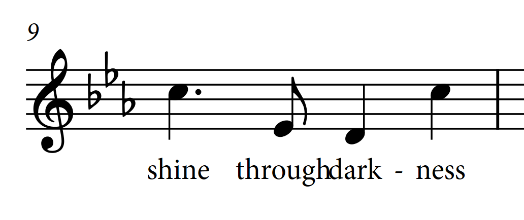
…which I think really obscures the rhythm, since the first three notes all take roughly the same amount of space. Adjusting the note spacing slightly to fix this:

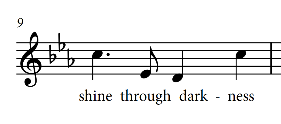
It’s then possible to achieve a balanced result by shifting through 3/4 space to the left and dark 1/4 space to the right:

I admit this is subjective, but in my view it’s much clearer.

My reason for posting here is because I wonder if some of this could be improved automatically. Proportion of lyric width for horizontal adjustment doesn’t seem to help. I’ve tried a range of values, and I don’t see much difference. In the example above, setting it to 2 1/2 gives me this, which is a bit of a head-scratcher:

I think it would be more effective to set a max value, in spaces, that lyrics could be offset. This setting could interact with Minimum gap between adjacent lyrics to achieve a more pleasing result.

In my opinion, it would also be helpful to have a setting in Note Spacing that would prevent the disproportionate spacing I mentioned above: that is, a smaller rhythmic value should never be given more space than a larger one within the same bar. Furthermore, it would be helpful to be able to set a value that would allow a sight-reader to immediately see that the differening spaces clearly showed the rhythms were different values.

This is admittedly lyric-specific, but I think it would be broadly helpful to address a common challenge in spacing music with lyrics. It would likely still require some manual work for detailed engraving, but perhaps it could do a significant percentage of the work.

PS: it would also be helpful if lyrics in different stanzas could overlap horizontally. For example, in the first screenshot, penultimate bar, “prayers” and “from” collide when viewed purely vertically, but of course it’s no problem since they are in different stanzas…

Dorico already quite happily tesselates lyrics on separate lines, like this:

CleanShot 2023-01-08 at 21.23.00@2x

(Indeed, it’s always done this.) The spacing in the above example is only “distorted” by the space needed for the hyphen between the syllables of “triumph”.

Regarding the wider issue (pun half-intended) of longer lyrics on shorter notes causing the spacing to be upset, I’m not sure that your proposal that Dorico should ever allow a shorter note to have more space than a longer one would really be helpful. Over what kind of span should such a rule take effect? Should it take effect for the current beat? The bar? The whole system? If you were to apply the rule to a very small range, e.g. less than a bar, then you would end up with uneven spacing in that bar; if you apply it to the bar, then you might similarly find that the spacing looks uneven across the system; if you apply it to the whole system, then you may well find that the whole system is now too loose, and you will find yourself wanting to force more music onto the system, which will just cause these distortions once again.

The Proportion of lyric width for horizontal adjustment option is a percentage, though expressed as a fraction. It doesn’t make sense to set it to a value higher than 1, because you can’t use more than the whole width of the lyric to determine how much horizontal adjustment is allowed. (I should probably make it such that you cannot even choose a value greater than 1.)

If you set this to 1, you’ll get the result you describe as a head-scratcher, but I don’t think it’s too hard to understand what you’re seeing there: the lyric “dark” is allowed to be offset completely to the right by 100% of its width, allowing the rhythmic spacing to be normal, but of course at the expense of any kind of sensible positioning of the lyrics.

I would probably be tempted to go for something more like this:

moving both “shine” and “through” a fair bit left, allowing me to then close the gap between the eighth and the quarter. In theory Dorico can produce a result like this, though in practice it won’t often do so, because it will end up preferring to move “dark” because it is a smaller movement than moving both “shine” and “through”.

This is certainly a very difficult problem and one that I would be happy for us to spend some more time on, but we need more input from some other experienced music engravers with specific expertise in this area. I will get in touch with some of the people I know and ask them to give me some feedback on how we might approach improvements in this area.

5 Likes

Indeed; it was only recently after a font snafu that I was prompted to adjust these values from their defaults, as my new font had different kerning. I came to discover that setting the values pertaining to hyphen spacing to be very small produces a pleasing result and has a notable effect on note spacing in tight layouts. I particularly noticed that reducing the preferred values corrected exactly this scenario, where one note column seemed to be unusually bumped sideways for no other apparent reason (the lyrics seemingly didn’t need the space). I was very glad to have made this discovery.

1 Like

I do think that our default engraving options for the gaps between lyrics and hyphens are in general set too wide. For my own projects I always reduce them. Perhaps it’s time we also reduced these values in the factory settings as well.

5 Likes

Thanks, Daniel, for engaging with this.

…huh! I learned a new word. :nerd_face:

I realized the reason for some discrepancy here is that if I make manual note spacing adjustments, then start nudging lyrics left or right, those overrides make the note spacing jump erratically, which is very frustrating. So my first step has always been to select all lyrics and nudge right, then left, so they all have offsets, and this prevents future unexpected jumps. I guess this cancels the tesselating that Dorico does between stanzas.

Within a bar, I think. It has never bothered me that some bars are longer than others. Par for the course where lyrics are involved, just as it wouldn’t bother me if a whole-note bar is much shorter than a next bar filled with 16th-tuplets. I think our eyes accept this sort of thing. That’s the reason I haven’t unchecked “Make space for lyrics”… I do want Dorico to give adequate space for lyrics, especially long syllables. What I find unwieldy and awkward is the disparity of rhythmic spacing within the bar.

I do admit this is subjective, and I’d be very interested to hear what experienced engravers think. I have certainly formed very strong opinions since pretty much all I do these days is hymnal work, but it’s certainly possible that some of my aesthetic sensibilities suffer from confirmation bias. :sunglasses:

2 Likes

Pedant’s Corner: an eighth note will only have half the space of a quarter note with a Note Spacing Ratio of 2. The usual ratio is between 1.4 and 1.6, which does indeed mean that smaller notes take up more space than the same duration of larger notes. (A quarter takes up 1.4 x the space of one eighth note; and two eighth notes obviously take up 2 x one eighth note.)

Sorry, I wasn’t clear I guess. That’s exactly what I’d do. I mean if an eighth note gets 1 space, a quarter note should get more then 1 space.

:thinking: just wondering, if the word originates from tessella (dice) shouldn’t it be spelled “tessellate”? It’s also new to me…

1 Like

I see, there is a difference between American and British English.
well, I will just have to use a pen on the screen :wink:

Sorry, typo on my part! It should indeed be “tessellates”.