This relationship of sharing the same GUI space is feeling a bit mouse clicky and clunky for me when I have a lot of editing that I want to do fast.
Put this in the context of needing to do an assortment of tasks to multiple events on multiple channels/tracks. These tasks include using VariAudio in the editor, using Spectralayers via ARA2, manual slice editing in the project window, all during which maybe or maybe not some channel fader volume balancing or insert plugin using/tweaking… Doing all these things sometimes in repeated successive manor, sometimes going back and forth to an from each process randomly depending on what is needed… and doing this with hundreds if not thousands of separate events.
I’m not sure exactly how this can be fixed, I have a few ideas formulating.
Potential fix 1:
Put the Editor inspector in the lowerzone Editor window itself.
Potential/and or Fix 2:
Go ‘More Cubase’, and give us more separated windows for each of these panels that we can save to custom workspaces, ie, Editor inspector as a separate window, and maybe even individual elements of the audio Editor inspector like VariAudio controls could be its own separate Window so it’s always available.
It makes sense because, well, if you open up the Editor window, this is how it looks. So it would be more consistent in the Editor Inspector was with the Lower Zone Editor… not occluding the project window track inspector.
I don’t think that idea is very good in reality although it might sound sensible at first. I think we need to consider what the different parts of the UI actually do and how they interact.
The inspector window’s function is to display parameters for any piece of content you select. Wether you select this in the arranger window, key editor or other viewport the parameters of that selected item shows up in the inspector for editing.
This is a very common interface paradigm used in many different programs. MS Office has it for instance. Even mail programs that have a preview window does this in a sense. Most graphics software as well (Photoshop, 3D programs).
The reason is to be economical with space. You usually only really need to look at one set of parameters at a time so it makes sense to have one window that changes its content depending on what you select.
The most valuable real estate in a program like Cubase are arguably the views that have an overview, like the arranger or key editor. Panels that show the whole project or actual work area if you like. If you waste this space with other stuff it becomes excruciatingly tiresome to work with the project as you’d spend all time zooming and scrolling to get to where you want to work.
You can easily try this. Bring the edges of all windows and the track width into the middle so the arranger/track view becomes really small. Try working like this for a few hours. It’s bananas.
One slightly different approach to this is in REAPER. There the inspector sits to the side but via a keypress you can open alternative floating ones like in Cubase you can open additional key editors. It’s useful if you want to compare parameters but that’s something at least I rarely ever use.
So an extra, not so useful, inspector in the key editor really only means less horizontal space to view the music which is after all what counts.
People typically have events broken up into sections on a track and work on one before moving to the next, and sometimes, need to break them up even further in order to cater to the algorithm of say VariAudio. It is INCREDIBLY annoying to have to reclick in every time… Imagine having a lead vocal with stacks, and then backgrounds with stacks. Might be 10 vocals tracks, broken up into sections. That’s a lot of clicking, and not fluid workflow.
False equivalency.
The lower zone is collapsible? In this case, I don’t need a lot of track width. Most people have pretty large screens, most are starting to ultrawide screens.
You’re not always working on everything at once, so this is really an non-issue. When someone is tuning vocals, they are typically only tuning vocals.
Why would I do this for a few hours? I don’t get it? I can just collapse the lower zone? I’m not really sure what you’re getting at.
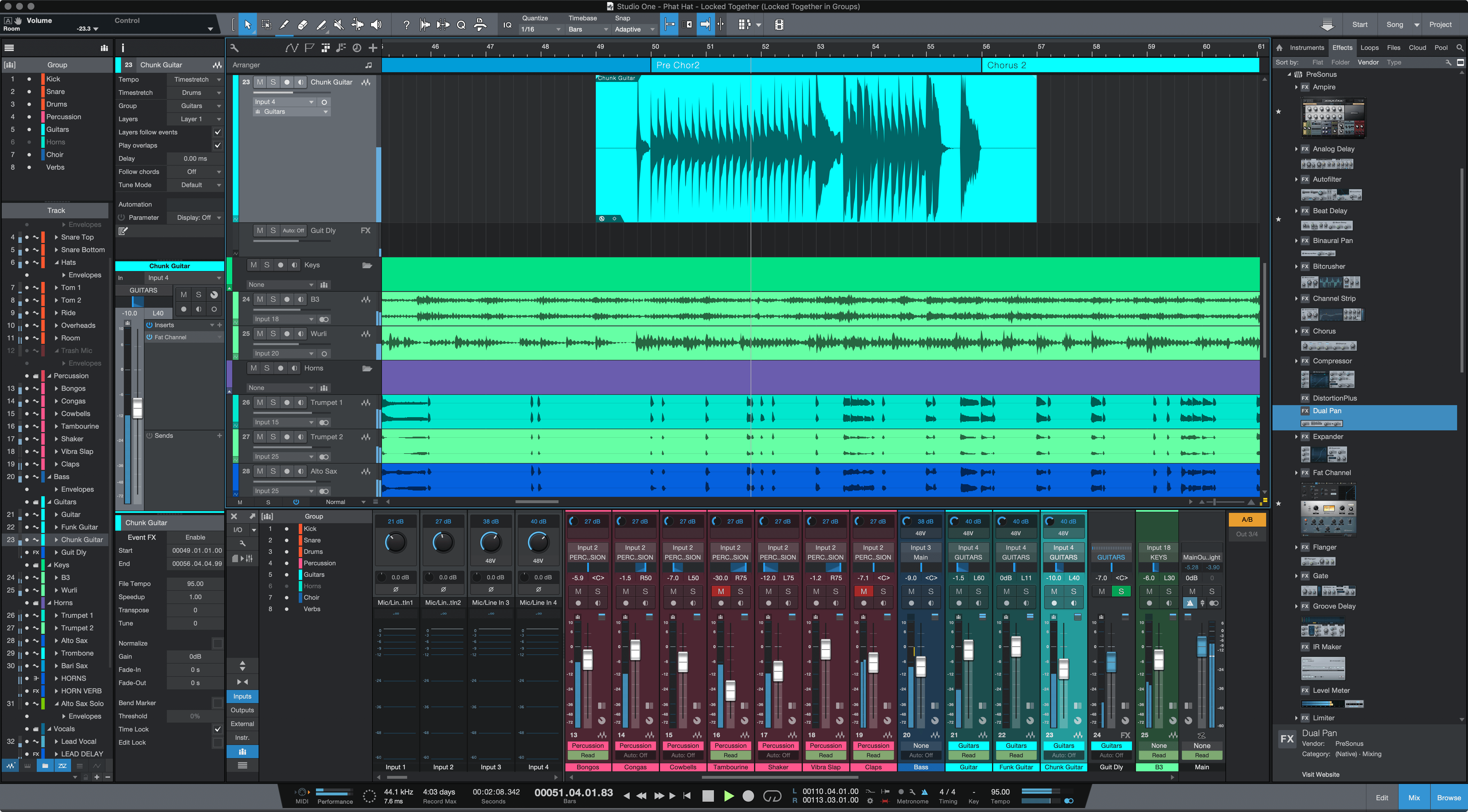
I’m not sure if you’ve noticed, but Studio One and such have extra inspectors, PreSonus_Studio_One_4-5.png (5120×2834)
There’s three inspector columns on the left
Not at all when you think about how people actually work, they might want to tweak the channel settings, inserts, ride the fader, do some manual fader automation, WHILE tuning the vocals in the lower zone. The clicking back and forth is absolutely crazy.
Or another example, would be composing MIDI but also crafting some FX on the inserts, the sound might be part of the composition. Or access the MIDI modifiers, or routing, or anything on the channel strip.
The clicking is really horrible right now, there should be as little as clicking as possible.
It’s a fair point that people work exclusively on certain parts and I don’t disagree the clicking is bothersome. I just don’t think having more panels all over the place is a solution to that. The more information you have on screen the more your brain has to work in the background to filter things out. You don’t always notice it consciously but it’s very tiring. It’s sometimes referred to as cognitive load.
The vari-audio clicking is bloody annoying. But that feels more like an oversight. If you’ve started editing vari-audio data Cubase forgets that as soon as you click on anything else which feels really odd. I hate clicking on that tiny little arrow all the time.
I’m not a big fan of too much stuff on the screen at all. I actually don’t like Studio One for that reason - it’s too much.
But the suggestion imo makes sense. The inspector pertains to the arranger… and anything to do with the lowerzone… should be in the lowerzone. It makes sense that it would have its own inspector… just as it does when you open the full midi editor window, or audio editor window. This would make the software overall more consistent.
Consistency is nice. Makes sense from that standpoint. It would be pretty cramped on the vertical though so there’d be a fair amount of scrolling with that solution.
Logic does something similar I think. Having the left part of the key editor populated with functions and buttons.

