I really like how my current score is going and things are generally roughly where I want them. However, I have run into problems with staff-staff spacing in places where, as for the text on the page, apart from the lyrics, I had to insert solo / tutti markings. Here is the situation with ‘avoid collisions’ set in Engraving Options:

I’m not a fan of this: the soprano staff is clearly too far away from the alto staff, and the problem gets more pronounced later. Here is the situation with ‘avoid collisions’ turned off:
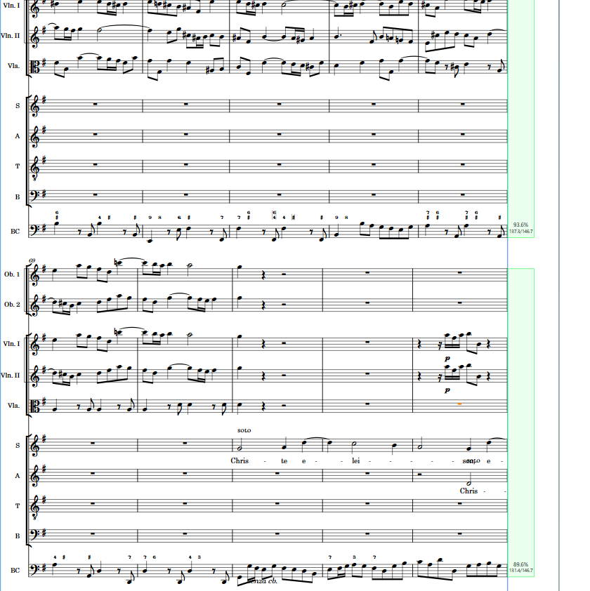
Now the staves look fine distance-wise; however, the solo marking overlaps the lyrics. (This of course happens later on, too.)
I can move the solo marking vertically using the Engrave mode; however, this will not automatically change the staff-staff distance, and I’m reluctant to modify it manually if, hopefully, other options exist.
I have explored the ‘Text’ Engraving Options, but changing them has no visible effect in this case (save for ‘avoid collisions’).
Ideally, I would like the staves to be a little more apart than in my 2nd picture, so that I could move the solo marking manually a little bit lower. Is there a way to achieve this, or do I have to change the distance between the staves manually, too? (I have never attempted this.) Or are there maybe some other solutions here that haven’t occurred to me? Thanks in advance!
(Dorico Pro 4. 3.30.1132.)