Using a template that gives me a text box for explanation (shown here outlined) and a line of music to illustrate, I’m getting differences in score text I’m not happy with

Not seeing anything in Engraving Options to help, custom properties or in Layout options, maybe I’m missing it.
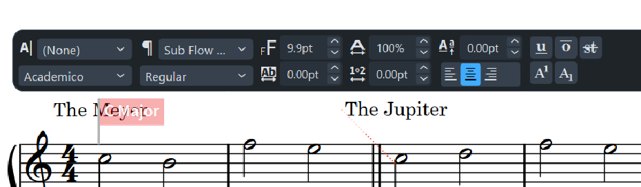
“The Meyer” (behind C Major flag) looks good, “The Jupiter” and the rest of them look too far left, I’d like to see them lined up with the note head maybe. Any ideas on how to tweak?