As it looks like the poor fonts in Cubase 7 could be a Mac-only problem, would a Windows user be willing to post a screenshot showing the same view as the attached? If C7 on Windows is as clear as people are saying it would be interesting to see just how good it looks.

The font on windows has actually improved a bit. It still isn’t near as crisp as 6.5, but it is now legible. I’m still not sure what aversion is to white fonts though. Notice how much better No Scale and Melodic Minor stand out with the whiter font.
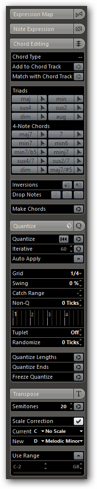
Thanks, yes that is much clearer - almost as back to how 6.5 looked on the Mac. If Steinberg can improve things on Windows, maybe they’ll be able to manage the same on the Mac ![]()
For more dramatic effect: side by side. Mac on the left, PC right.

+1 for improvements!
Wow, that’s a staggering difference!
Deja “View” all over again. (2011 font display problem.)
Thanks Steve, that does show the difference dramatically. I’m still surprised that Steinberg haven’t acknowledged the problem - I’ve reported it as a bug and logged it twice with technical support. I know there are more pressing problems to fix, bit it would be easier to live with if at least a chance of improvement was on the horizon.