I have thought of creating a new timpani player whose part will not be printed where I would write the pitch, and then create a Music Frame of that player in the timpani part.
There’s no built-in feature for this, though I agree it would be nice to be able to do this at some point in the future. You could certainly use a music frame for this, though it’ll be a bit fiddly. It might be more practical to create SVG graphics using the graphic slices tool and then import those SVGs into graphics frames. I would suggest only doing this at the end of the layout process to avoid having to nudge them repeatedly, as they won’t be associated with the staff and thus will need to be moved if the vertical position of the staff moves.
It looks, deducing from the look of it and the title ‘Slice’ it was a graphic prepared in Dorico.
My head still hurts having had it bitten off by someone once when I suggested using a graphic to construct an unsupported metronome marking! But it worked, and so does this.
I have created similar graphical items by making a graphic slice and using the slice to create a playing technique. Enter the PT on beat 1 of the first measure and drag into place. Theoretically, the graphic should now remain where you put it.
Ever since I’ve seen @dan_kreider’s fonts, I’ve always wanted to design a font with ligatures myself. This appeared to be the perfect project for this, so I started yesterday. Thanks to some initial pointers from Dan and despite quite a few setbacks along the way, I’m quite far along by now. Current features are:
quarter, half or whole noteheads
optional stems
optional accidentals (flat/sharp)
range from (assuming a treble clef) Fb3 (three ledger lines below staff) to E#6 (three ledger lines above) - 315 different glyphs so far.
I’m planning to also implement lines like , and I still need to do clefs and barlines.
Oops, now I understand what you said in the first place! (Trying to read too hastily on my phone. I saw “Fb” and it appeared to match the lower note with no clef.)
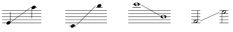
You can write q for quarter note, h for half note, and w for whole note. Colon and semicolon add some space between notes. Default note position is the middle staff line.
So ;q;h;w; gives you
A positive number after the note value moves the note up, a negative number moves it down. 0 stands for 10: ;q-3;q-1;q1;
You can add accidentals in front of the notes: ;bh-2;bh1;;#w-3:#w1;
If you don’t want stems, add an “s” after the note. Also, there are clefs (T for treble, B for bass, A for alto, t for tenor) and barlines (|, ||, and ||| for single, double, and ending barlines): Bbq-6s;q-5s;q-4s;bq-3s;bq-2s;q-1s;qs;bq1s;|||
The lowest and highest notes: Bbw-0;T#w0;|
It’s still a work in progress; the lines between notes are a bit of work since there are so many possible combinations, and I want to automate generating those.
Thanks!
I think I need to change the spacing a bit. At the moment, each glyph is just as wide as necessary (and since whole notes are wider than quarters, sharps wider than flats, a scale looks not as nice as it could. I’ll try making all the accidentals the same width and change the blank staff to be the same width as an accidental. Maybe that will help.


 , and I still need to do clefs and barlines.