Since Dorico doesn’t offer to box text in some text frames, I’ve created a new text font where you can use parenthesis ( ) , accolades { } and. [ ] as enclosures too. The font is free for use (OFL) , here it is:
(example used by permission from @MarcLarcher Edition)
It might be tedious to add the parenthesis and the accolades at the beginning and at the end of each text… but this is just a temporary solution till we see Dorico allowing boxing text in every situation. Enjoy!
@YourMusic.Pro We have an enclosure version of Petaluma already, included with the Pori fonts, here:
The Pori music fonts are only useful in Sibelius, but the “Pori Rehearsal” fonts are text fonts that can be used in any software. There are three versions: an Enclosed version, as well as Overline and Underline, useful in situations like these:
Slight plug: We also bundle the three Pori Rehearsal fonts with Scoring Express for Dorico, so if you’re a customer of that product, you already have these fonts
Here are a couple of examples of using Pori Rehearsal Enclosed. (These are all based off stylistic sets already present in Petaluma Script, but not easily accessible)
Thanks for the heads up! This works really well…
However, the icing on the cake would be a version with straight vertical sections of the enclosures, as opposed to the curved ones.
But that’s high level whining, really…
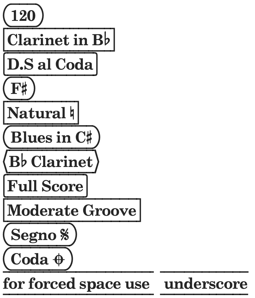
I updated my NorBOXES font from v 1.0 to v1.1 by adding the flat sign to the pipe bar |. Segno and Coda signs are also added. The accolades { } have now ROUNDED corners while [ ] have RIGHT angles.
So, If you try the following combinations…
(120)
[Clarinet in B?]
{D.S al Coda}
(F#)
[Natural @]
(Blues in C#)
<B| Clarinet>
{Full Score}
[Moderate Groove]
(Segno sg)
(Coda cd)
for forced space use _ underscore ( can be useful for separating two successive boxed texts )
Nor, what I’ve done with Nepomuk is to access the accidentals with a ligature. I use $b, $n and $s as the ligature characters that trigger the flat, natural and sharp. I think that’s better than ‘overwriting’ any one glyph. (I got the idea from another font, I can’t remember where I saw it.)
No, they’re not used by Dorico tokens, which are {@ @}. I just think it’s a nice way to get at Unicode symbols without taking the place of a standard char.
You’re right @benwiggy, it’s better to keep the glyph positions untouched, so I added the features of $b for flat, $n for natural and $s for sharp. Thanks Ben!
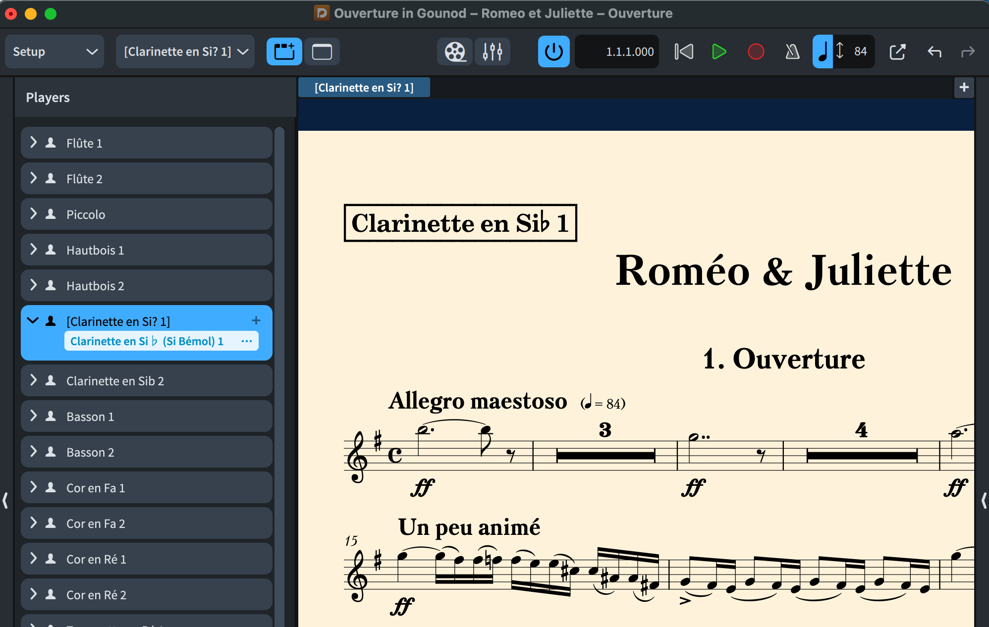
tangentially related: I feel completely stupid but… where/how do I change the font so only the instrument label (that shows in parts) uses this font, and not the actual instrument name (to the left of each staff in the score)?
EDIT
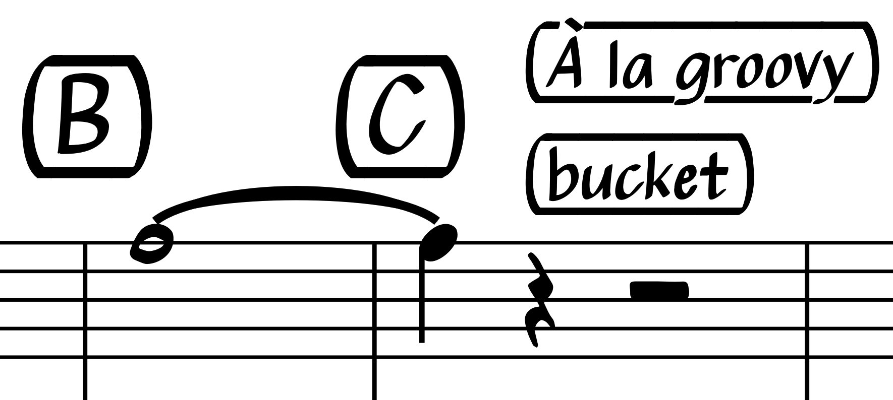
ok, I found in libraries where to change that font, however, now I get a bold text with only a single line over it, no line beneath.
I’m also not getting the vertical line at beginning and end, of any type, with [, {, or (.
here’s a screenshot of the score, in Setup mode, where you can see the instrument name/label to the left I am trying to change, and the result in the part itself, as well as the paragraph style dialog box with the options.
I do have regular, and not “bold” set for the font style.