Regarding the project window and mix console, it looks more clean, coherent and pleasing than before.
Thank you for the update!!!
Regarding the project window and mix console, it looks more clean, coherent and pleasing than before.
Thank you for the update!!!
I think adding regular font is a great idea. I think on top of this, an option to have the folders remain bold, and tracks be regular could be a cool idea. Make it easier when scrolling through a lot of tracks and folders.
Cheers!
Thanks for announcing the update.
I was actually happy about the it, but unfortunately:
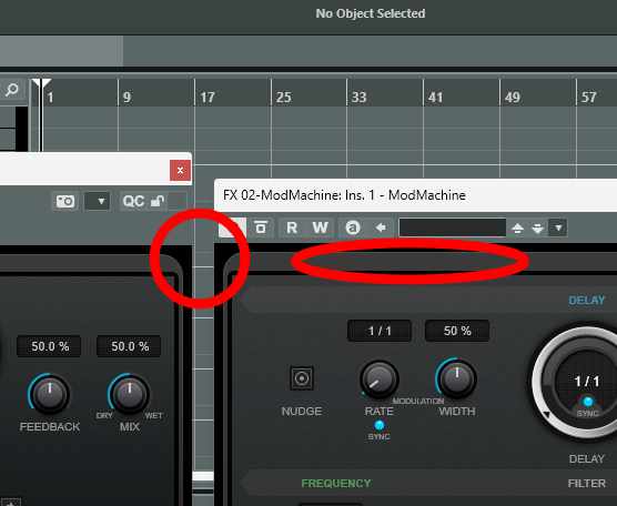
As soon as I open an audio event to edit it with VariAudio … there is no sound at all … there is a problem and the position indicator jumps back and forth - and the inserts on this channel are muted.
Where can I download Cubase 13.0.21?
Can’t find anything on the website and the same thing in the download manager.
20 posts were split to a new topic: Cubase 13 is crashing when opening the MixConsole
Finally. Good job Steinberg. ![]()
Cubase 13 Pro now actually looks professional.
If you can fix these ugly spaces and hideous border in stock plugins I am going to love it even more. Heck I might upgrade even my Nuendo 12 licence.
.
like the new look better, the regular font too, didn’t dig into it, but overall looks better, just some areas need to get in par to the new Cubendo 13 GUI , like the control room section, preferences window, pool window etc…
From the 13.0.30 release notes:
“There is also a new option “Track Name Font Weight” in the Event Display > Tracks page of the Preferences dialog that allows you to select between “bold” and “regular” font weight for the track name in the track list of the Project window. We have kept “bold” as the default for now, but please give the “regular” setting a try and let us know what you think.”
You asked to let you know what we think: the new “regular font” option really makes a difference. I personally like it a lot better than the default “bold” option! Thank you for that tiny but good improvement!
Because you’ve asked: regular font is much better.
And still blurred as hell , listen to customers , ppppffttt , total crap . Visually impaired people still have no fix .
Why does the “non bold” font have to be darker and duller? Can’t it simply be “smaller” but still just as bright?
Love it!!!
Yes, the fader caps cannot be colored in Cubase Elements. You need at least Cubase Artist. There you can change the fader colors in the preferences/User Interface/MixConsole Fader Colors
That’s not the point. I don’t want to have the option to change the colors of the fader caps. I just want fader caps to have the color they used to have before Cubase 13.
Fader caps for groups used to be blue, and purple for FX channels. Now every fader cap is white.
Great, thanks for listening to the GUI font complaint and giving us options.
5 posts were split to a new topic: Solo defeat / exclusive is not working as expected in Cubase 13.0.30
Steinberg, thank you. This is a great update. Still lots to do, but it’s a step in the right direction. Well done.
13.0.30 introduces further user interface refinements that improve readability and the overall look and feel in several areas.
Most of the refinements can be found in the MixConsole and in the track list of the Project window. You will notice that we have reduced the brightness of the white font, icons, and other elements to lower the contrast on dark backgrounds. We have refined the visual appearance of several elements to streamline the user interface and improve the usability when highlighting selected tracks or channels. The inversion of text and icon colors is now more consistent.
There is also a new option “Track Name Font Weight” in the Event Display > Tracks page of the Preferences dialog that allows you to select between “bold” and “regular” font weight for the track name in the track list of the Project window. We have kept “bold” as the default for now, but please give the “regular” setting a try and let us know what you think.
Applause for usability improvements.
Thanks, Matthias!
Funny thing … I was one of the first to jump up and down complaining about the bright white bold text. When I switched to the new standard font, I found I really missed the bright white so switched back. Perceptions, eh?
Solid update so far. Nice to have the option of the font change, and other colour improvements have remedied most, perhaps all, of my concerns regarding the GUI.
Thumbs up from here on Win 11, AMD & Nvidia.
