Change for ‘change sake’ is always a bad idea.
Chasing a trend in design or trying to appeal to a specific demographic by pandering to them, or trying to predict what might be trending, is even a worse idea.
The reason professional tools became industry standards in the first place was because of the practicality of function first. Tools that are easy to use and predictable in behavior will always win out over trends and gimmicks in the end.
Notice how no one ever says the La2a or 1176 or SSL Buss Compressor looks dated and needs a refresh? Because they work consistently and that leads to creativity, instead of getting lost in the tech zone. If something is difficult to use or difficult to see, or produces inconsistent results, all the hype and spin in the world won’t save it.
Sebastian_Alvarez, the OPUS interface is a perfect example, clean elegant, and most important of all, efficient. The GUI doesn’t get in the way or confuse you. It simply waits for you to be creative.
The Luna interface is another great example. Especially the differentiation of the insert effects. Having clearly deferent compact GUI’s of each makes identifying changes in a big mix much faster and clearer than jumbled fields of bland white text on endless grey.
I have to add my agreement in here in the hope that the devs will see just how many users are not liking these changes.
there’s lots of elements I dislike, but by far the easiest change they could make that would help is to have control over the font brightness. its full white, and what with way more GUI elements now being white text, its just way too much. simple control in preferences to change this how you want would help a lot.
After reading this entire thread and seeing the screenshots, I thank you all for saving me the money I would have spent on the update. C12pro has been fantastic for me, and will continue to be fantastic. I’ll wait and see what direction the Devs choose to go from here. Nothing in C13 seems essential or like a major improvement to my workflow that is worth the daily punch to the eyeball that is bright white everywhere so I’m gonna sit this one out.
Overall I like the updated design, it just needs tweaking so it’s less of an assault on the eyes. Simple things would make a big difference.
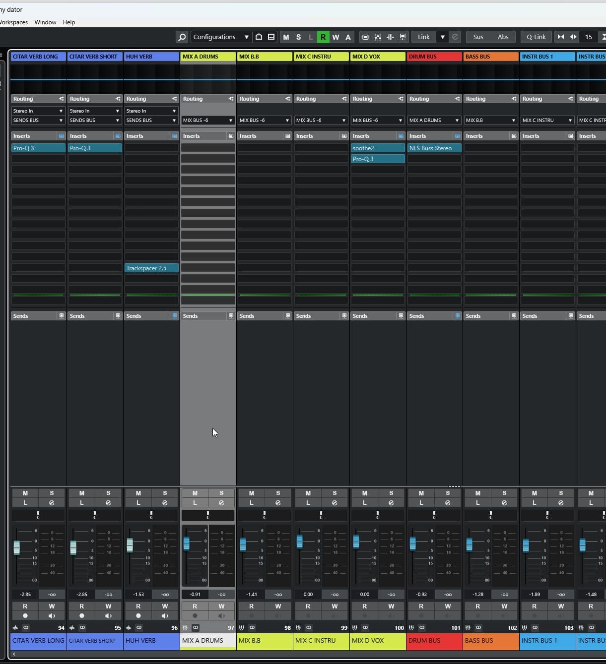
For example, when colourising channels in the mixer, the new grey container underneath the fader causes too much of a contrast which confuses me when looking at a lot of channels. It would be preferable (for me at least) not to have this grey container when using colourised channels.
Here’s an example I’ve edited, removing the grey container from the faders of the last 2 channels. - this would be much easier on the eyes when using Colourised Channels IMO and make it more like C12
In addition to this, the inspector doesn’t seem as easy to decern at glance due to the design change. Just something as simple as a light colour could help break up the control sections making it easier to find what we’re looking for. Here’s a rough example:
I totally agree. After about 20 minutes in I get annoyed eyes working in CB 13. It took me at least 3-4 hours in CB12. This is a very important issue to fix asap imo.
This is interesting. I used Studio One Producer 2 I think back in 2014 when I first dipped my toe in these waters, but then I moved on to other things. I still can run that old version of Studio One Producer, but it doesn’t seem to have an upgrade pricing to the current one, so I didn’t even consider it.
But when I see your screenshot, that doesn’t look bad at all. People say it’s flat, to me it doesn’t seem so flat. I can see the buttons pretty well, and to me they seem real buttons. They designed them with a very slight emboss, just enough to make the button more realistic, like it has some depth.
Why do we need to copy what the latest OS is doing? The issue here is the changes Steinberg made are NOT more readable. So if their goal was to make it more readable, as you claim, they failed entirely.
That’s the very issue people are having with the changes. Some of us here find it’s a lot more difficult to use this software with the tiny fonts, tiny buttons, and more tightly packed controls. And it doesn’t seem to obey OS scaling either. So we’re currently just stuck with a harder to read and thus harder to use GUI.
Back in the day, I left Digital Performer at version 6 because the GUI was harsh white and glaring — you just couldn’t work on it anymore. People started hacking the program and changing the graphics for themselves. Version 7 introduced the option to choose from a number of GUIs.
Today, it still looks a little crowded, but it’s improved after that era of disaster.
One thing that always bothered me prior to buying Cubase 12 was the GUI, which always looked more like a toy than a professional tool. It’s improved, but v13 definitely suffers from having made some hasty decisions design wise. They definitely need to fix this in the first update and not do as DP/Motu did by making people wait for a new version of the program.
I like Cubase. I was full time with Studio One from v1 to v5. I could learn to LOVE this DAW, as long as it plays nice with my eyes.
A lot of replies to read but I’ll add my voice that there is no visual separation/contrast between information that matters and information that does not.
EVERYTHING IS NOW SHOUTING FOR ATTENTION MUCH LIKE THIS SENTENCE. As it is in music, when everything is loud nothing is loud.
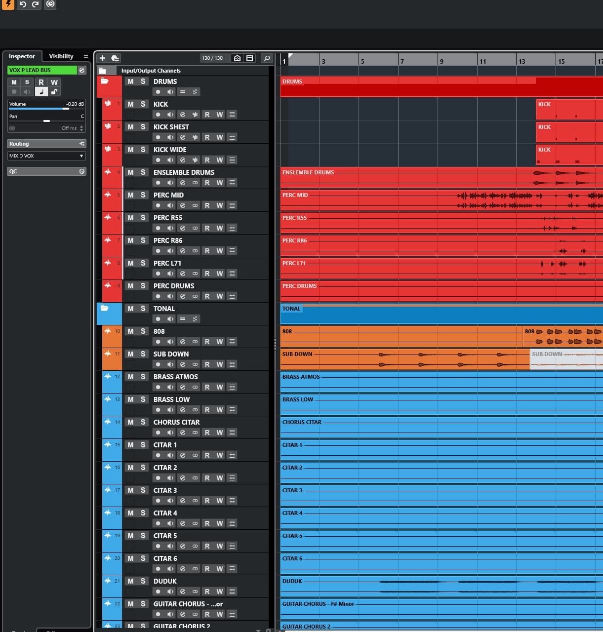
Track names are usually the important piece of information in the main track zone instead of every button shouting for attention. In the mixer we do not need focus on the rack headers but rather the things contained within them (e.g. your inserts). Hopefully Steinberg will make some necessary changes with this version as right now v12 feels like a UX upgrade instead of the other way around.
Man, these screenshots made me realize how ugly the mixer is compared to C12. It’s not hideous, but the lack of buttons that actually look like buttons is really annoying. Cubase Pro 12 had a great way to simulate the look of buttons without looking like it belonged in 1998.
thank you B.A. for your comment - I’m definitely not upgrading to this after reading your comment and seeing the vomit of an interface that Steinberg has placed on the table with Cubase 13 Pro.