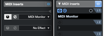
Hi, I am also having mainly a problem with the GUI so far. I am running a macbook pro attached to 1440p Monitor which isn’t ideal for mac scaling but Cubase 13 is so much worse than Cubase 12.
My main problems:
1. All the boxes have less height than bevor, making the text within harder to read, also icons within boxes are smaller:
2. Font sizes: Some headlines have smaller font size but greater small weight making it even harder to read (e.g. “Track Version” in the inspector (see above)) and at the same time some things have really small and tiny fonts like the QC in the inspector (see above).
3. Too much contrast: In general I have the same opinion that most of us here, that there is too much white text on dark grey background. And we got rid of the blue highlight color, which means even more white on black. See here:

4. Too less contrast: At the same time we have bad contrast in some areas like the track headers in the sequencer, because we have white text on light grey background. Also in the mixer, between fader and channel meter. Again making things hard to read.
5. General inconsistent styling: It seems like some things got changed with the new style guide and some are not. For instance does the control room look just the same as in Cubase 12 with the blue highlight color and no flat design buttons etc. Why? I prefer the Cubase 12 design but when you decide to apply a flat design it should be consistent.
I think most of the design changes weren’t necessary and they rather should have worked on a more customizable GUI, giving the user more options to decide about constrast, font sizes and colors etc.
and yeah please bring back the old fader caps ![]()


