I’ve been working on a SMuFL version of the handwritten GoldenAge font (with the original creator’s blessing), with which some of you may be familiar.
It originally came as a text font and a music font; but by the power of SMuFL, I’ve combined the two into one font! Which may or may not be a good idea.
Anyway, the font is currently ‘in beta’, and if anyone would like to try it out (as I don’t really do much in this style) and let me know anything egregious, that would be useful.
Bear in mind that Dorico 4 is perhaps less useful for testing fonts, as any missing characters will get filled in by Bravura.!
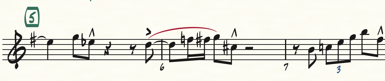
Thank you - the font looks very nice and I appreciate your and the creator’s generosity in making it available. One thing - the scoop is kind of small and wiry. I’d suggest using the same symbol as the doit, which appears at the end of the pictured example.
Also, you might consider thickening the lines (staff, stems, ledgers, barlines) as well as slurs and ties in your demo document, similar to the attached.
The staff lines can certainly be set in the font’s JSON file. Can you suggest a value? The ties and slurs will, as ever, need to be set by the user. There could be a default project file provided, of course.
I’m not sure that the original font had a scoop: I can’t remember what I used, but I’ll certainly take another look at it.
Hey thanks benwiggy and FredGUnn! I’m writing in the style of that age, will be fun and mood setting to use this font. Petaluma is a great font - and I live near the town, but this has a nice character too.
I installed via the Font utility in Windows but it’s not showing after a Dorico restart, anything else I need to do?
Edit, here you can see it is installed, and Dorico fonts
Nice! I’ll play around with it later today. Not that it really matters as it’s just an example, but m16 (bar 3 of the blowing changes) should be “Dm7 Cm7” not C+. I was using the progression from Dance of the Infidels / Sippin’ at Bells there to get to the tritone sub leading to the IV chord.
Thanks, no I wondered about that. Checked the GitHub READMEs for that, they usually contain such info so a good idea to add it there. Put the installation into the top level one under a heading, and I’d suggest put them both into a zip file - easier to download (GitHub wants to show you the json as text)
The G7 in m8 and m21 can be G7+ if you wanted that in the example. That C+ instead of Cm7 is just in an established progression most jazz musicians know, so it sticks out a bit if you change it.
Looking in Library → Font Styles, most of them are set to Golden Age via this default setting, but a couple are still Bravura (like fingering). Changing those didn’t make a difference, however Library → Character Styles has one entry, Music Text set to Bravura. Changing that gives this
Better?
Edit: I think this probably looks better.
So here’s the recipe to use it, set it to both on the Hub, then at least change the Music Text Character Styles and you should be good for most circumstances.