Now we’re cooking with gas. First one is the flat symbol from the original text font, which is a bit different, but fits nicely.
Chord flat is now better angle and size, but a bit far away.
Now we’re cooking with gas. First one is the flat symbol from the original text font, which is a bit different, but fits nicely.
Chord flat is now better angle and size, but a bit far away.
That’s weird, I think the flat is parallel to the B, but it doesn’t look it … oh I know why, because the eye picks up the left hand vertical line of the B which is different than the angle the flat is at.
@benwiggy Nice job! porting GA to SMuFL, nice addition of some AshMusic glyphs there inside the font. I like it. Bravo!!
You know, I was also thinking about merging my text font with my music fonts too. Good idea too!
It’d be nice if you make a bold version of the GA text font for titles or any further use.
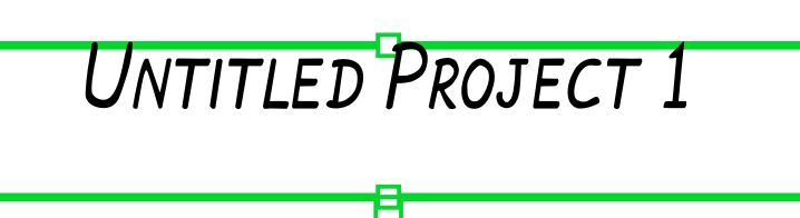
Using GoldenAge for title give me this:
Seems like the font is being clipped from the top, maybe you’ll need to update/calculate again the measurements using your font editor.
Is that an ascender issue, or too high of a descender value and set to vertical center alignment?
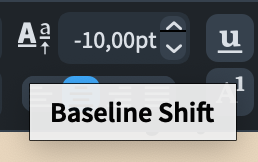
It can be adjusted through Baseline shift:
But still, it needs to be automatically and vertically centered.
Using Academico font:
Using GoldenAge font:
Maybe the fact of merging text and notation symbols caused that… ![]()
I’ve put a revised version on the site. Please let me know if that’s any better.
Seems to work well for me! It was a bit tricky to download the json file from github, but I managed to do it by downloading the zip.
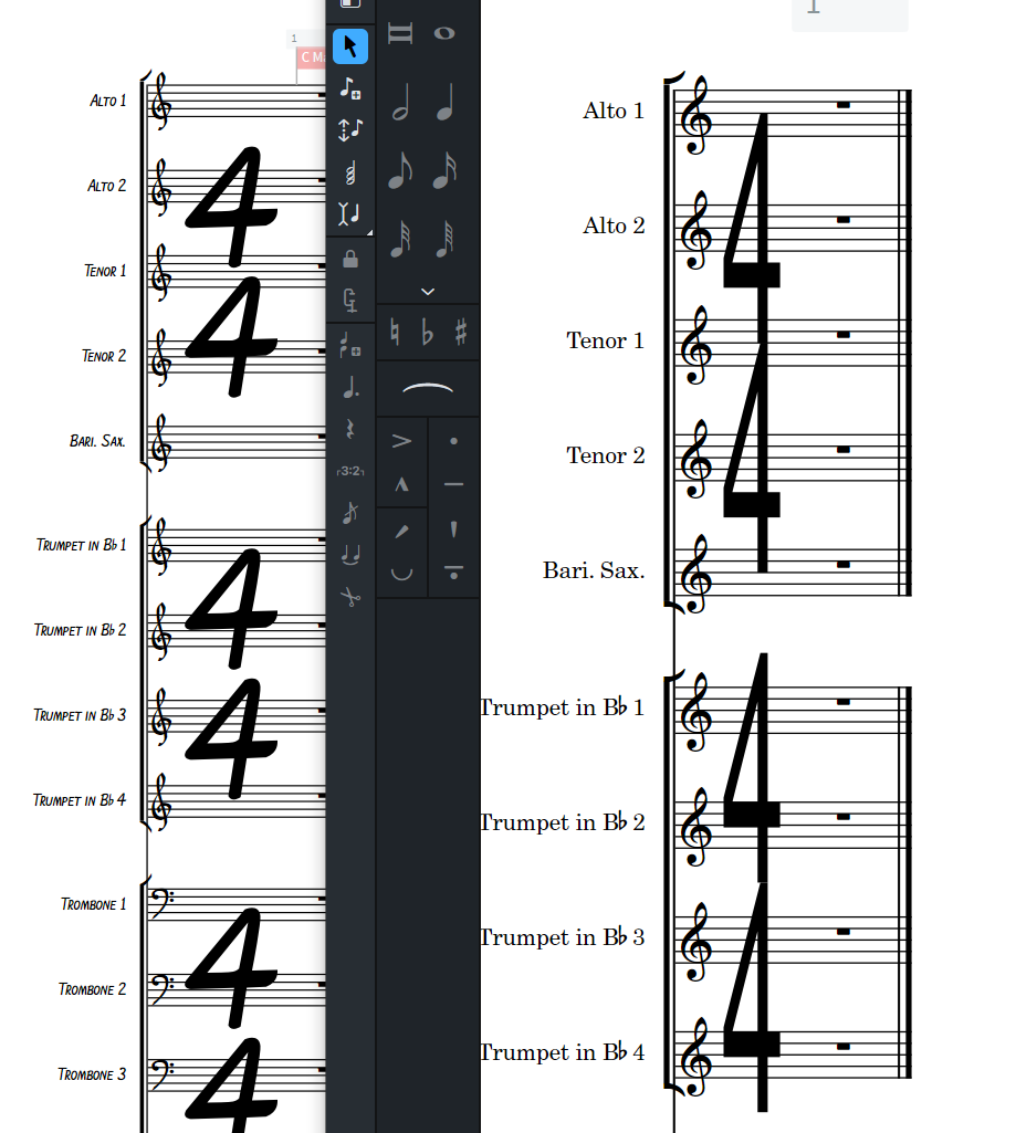
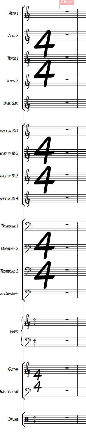
Looks good. Note if you use the large spanning time sigs it will default to Bravura (right below) because it’s sans serif in layout. I think the Golden Age looks better here but it’s a little big and wide especially, adjust down in the Font Styles/Time Signature Font settings to about 16 (the second is 12 which is better I think)
Thanks. I don’t think I added any of the various styles of time sig, so yes, it’s falling back to Bravura.
I’ll have a go at adding a ‘Narrow Sans’ style, which will be GA, but narrow.
The Library Manager is such a life saver, I took that example and easily applied it to an existing score.
A puzzler is the Immediate Tempo Change, neat feature I hadn’t noticed before which is that when you select an element it tells you what it is in the status bar. Anyhow it was set to use the Default Text Font (Golden Age), so I set it explicitly as you see here, but it still looks like it’s grabbing a fallback - that 52 is something else.
@benwiggy that would be great! Loving this font.
You need Font Styles > Metronome Text and Music Text.
Beautiful.
The Marcato looks - well - stressed compared to the unstressed, or bold vs non bold. Seems like the unstressed is too thin, but maybe that’s just me. Anyhow lovely font.
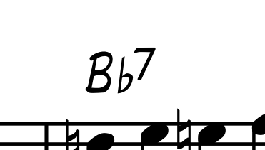
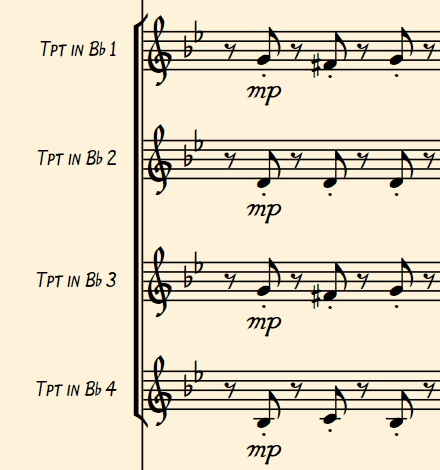
You’re still getting Bravura for your Flat symbol there, btw.
So many settings! Thanks, getting this set up in a canonical reference file - much bettah …
Also finally switch the cream color Score <-> Parts, since I spend all my time in the score
OK, Updated the font with options for narrow time sigs: v. 0.11. Available now.
One general question about these kind of fonts: I downloaded, installed everything where it belongs, and when I open an existing project, I set music fonts to Golden Age but not much changes, just the clef and time signatures. When I do the same with Bravura and Petaluma, everything changes all at once… What am I doing wrong?
Thanks, Benji
Bravura and Petaluma are special cases, being the house fonts.
However, you should find that everything which cascades from the Default Music Font should follow suit.
But yes, some setting of Font and Paragraph styles may be in order.