How to set pages with text and music

Hello everyone,

(Dorico Pro 5)

I should set up the job for writing an educational book and I wanted to understand and get advice on how to set up work with Dorico.

I thought of 2 options:

1 - Write the musical parts with Dorico and then import the image files into a text writing software (Word, Pages for example) and write the text.

2 - (option that interests me more) Do all the complete work only on Dorico.

In the case of the second option, how would it be appropriate to approach and set up the work with Dorico? The first thing that comes to my mind is to write the musical parts on several streams and then on the first stream insert the various frames (Musical, Textual and Graphic). Is this a fair approach or are there others that are faster and more productive?

I await your advice,

Thank you

:musical_notes::musical_note:

P.S.
Attached I put a fair example to make it better understood what I mean.

I have done several of these sorts of publications. If there is lots of text, it is almost always best to do the musical examples in Dorico, export them as PDFs or SVG slices, and do the book itself in InDesign.

6 Likes

If InDesign is not within reach, there’s Affinity Publisher. Not as polished and intricate as InDesign, but it does the job, and is more affordable.

1 Like

So it’s not convenient to approach the work only with Dorico?

Would software also be good, instead of inDesign or affinity, like Pages?

Music samples in Dorico and the rest in ā€˜external application/software’, depending on skill and budget.

1 Like

InDesign = Expensive, fairly competent for books although I’d never used it as such.
Affinity = I have no idea, many praise it and some expert users are on the forum.
LaTeX = Without doubt the way to go.
MS Word = Never, I repeat, Never. Might be good for text drafting but equally competent AI editors exist today. Great on review if multiple authors are involved.

2 Likes

InDesign: Way to go and the choice of most graphic designers. I’ve made some book layouts with it as well as this kind of jobs. My tip for you is this: hire someone to do the layout for you if you can’t use it well enough or don’t want to purchase it. It is pretty much the standard with the print houses and they give you the specifications of the job in question. Being the industry standard software makes it also easy to communicate back and forth.

1 Like

Thank you all for the answers and for the advice :folded_hands:t3:

I don’t think this is an issue any longer. A print house certainly do not want the source files. They usually ā€˜hate’ that. PDF is what they need and they have the tools to change colour scheme etc. if they need to. I’m not sure much intricate colour is used in a music book however.

As long as you can produce a PDF they will have no problem with it.

2 Likes

Yes, that is true, but from my experience it is easy to talk about some technical issues and get advice during the project, if a need should arise.

Here in Sweden most printers have fired the ā€˜art dept’. 20-30 years ago any printer worth their name had a section were they did the layout. That is all gone. Printers here do one thing, print. They would probably not know anything about a software. (I would mostly likely get no help from my printer, unless it is some PDF problem.) Many of the staff back then started layout business of their own when they got fired but I think they are all gone. (SO)HO-publishing have taken over - we are all artists now in our homes. Granted, the established applications have large and helpful forums, just like Dorico has. There is always help online for most things today.

2 Likes

Here in Finland mostly as well, but I think a satisfactory result can be easily achieved by the OP. Thank you for the discussion!

1 Like

Sorry, I have to disagree about Word. The fact is that most users treat it poorly/casually and don’t have any idea what it can do. I have seen excellent work done in Word that resulted in publishing of a high caliber. It has everything that you need for basic publishing: paragraph styles, advance font control, inline graphics, pagination, etc.

I’m not saying it’s a full DTP by any means, but it is much more powerful and competent than its reputation. It’s a mature program, and there’s absolutely no reason the OP couldn’t do their project in it.

Regarding pre-flight and color checks: yes, printers want only PDFs, and it’s important the color profile is set up correctly.

2 Likes

It is somewhat unclear what OP fully requires for his book, and since I dropped Word decades ago, I cannot fully judge what it can do today, if it can ā€œkeep paceā€ with LaTeX, which I strongly doubt. Once you learn a pro tool, you never look back, just the same way I’d never start Sibelius again, after using Dorico. You could do fine with Sibelius, but it’s not Dorico.[1] Same goes for Word IMO. If the OP wants a publication with a premium look, Word is not the tool IMO.
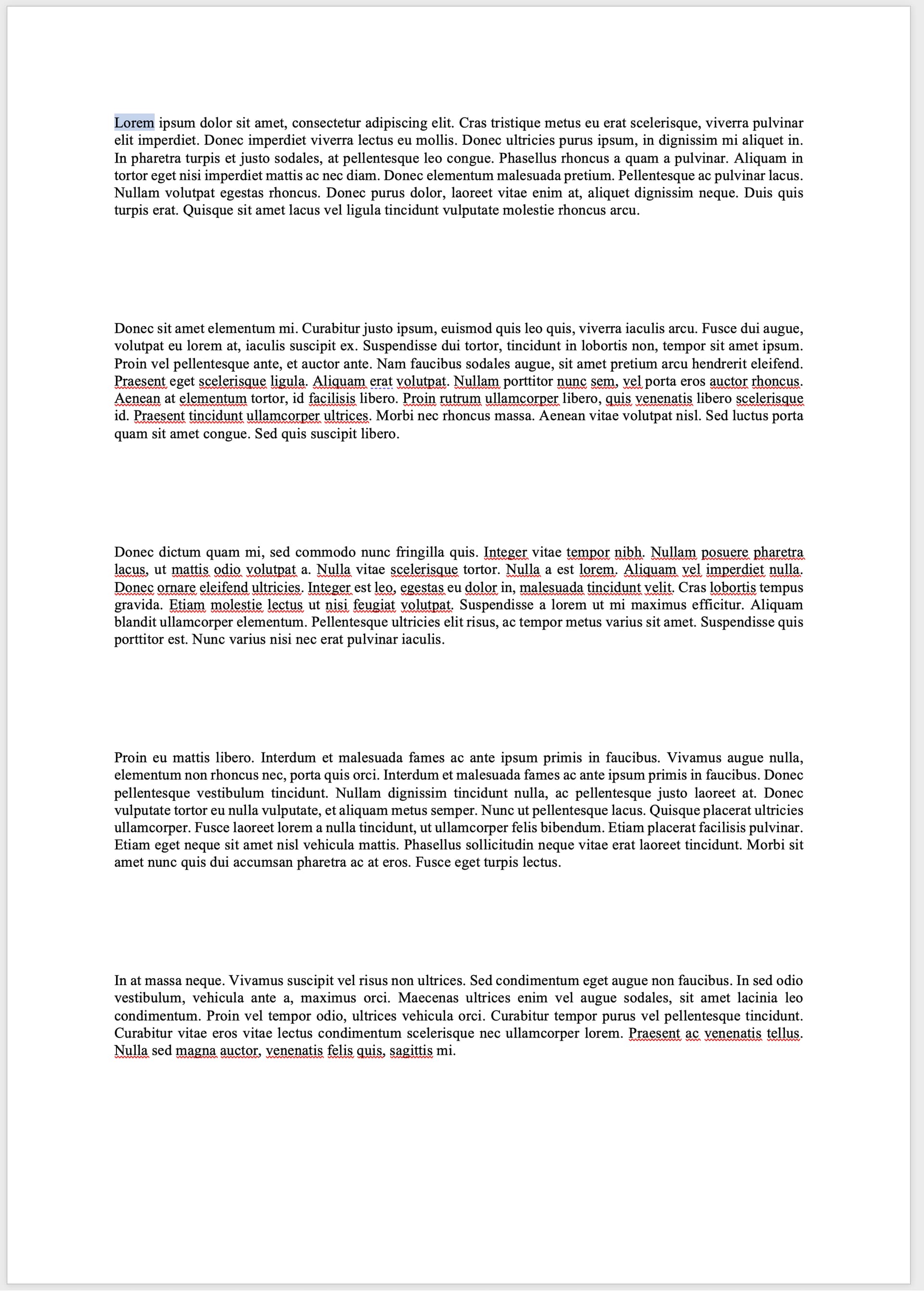
I tried the ā€œvertical flushā€ in Word (not something OP would probably use since his text might be too ā€˜fragmented’) and got


I think no further comments are needed.
You would have to force TeX pretty hard to get this output. I bet most of us would never accept a music page that looked like this. I recall a discussion about ā€œwhat to do with the last page when there is not enough musicā€ some time ago.

From the OP’s sample, he might need an example counter, and one that is configurable. I’m not sure it can be done in Word. It can probably number tables and figures, but can it number ā€˜anything’? (There was a similar discussion for Dorico some time ago, with a user wanting to do exercises and restart the counter at each flow. I’m not sure it was solvable. But, Dorico is not set out to be a complete book program either.)

We should probably learn more about the publication requirements before deciding what deal breakers might exist in various software.

This question comes up from time to time, and perhaps there is a survey article at Notation Central or other ā€œreview sitesā€ that could be of interest to the OP. It would require a broad knowledge of many tools, and I’m not sure such a person exists.

I’ve never cared much about colour profiles, but I don’t do coffee table books or Vogue art magazines. In my younger days, it was all the hype of CMYK, CMS, and RGB (and which one of them…). Modern printers seem to handle it all flawlessly today, at least for modest demand on the publication.

[1] I had to open an older Sibelius document today to look at an old score, and what I thought was fine then. I didn’t like it at all today, being used to the superior output and layout of Dorico.

1 Like

Word definitely has its limitations, and I agree its justification engine isn’t perfect. My only point was that Word is better than its reputation.

For a serious publication with any complexity, I would certainly do it in InDesign. I’m not smart enough to use LaTex.

I’ve used InDesign for many things. It is a joy to use. I did all my editions in PM6.5 at the start and then InDesign. In one document (sheet, like a old paper road map) I mounted 100 music pages as a wall poster. It is very powerful.

I’m a bit sceptical to the ā€˜anchored image’(?) function in ID, I’d never got it to work as I wanted, but that is probably due to my skill-level, more so than the software itself.

It has a very cool reg-ex function to replace things as I recall.

LaTeX is a night-mare the first week(s). If you can handle music (which is very complex), LaTeX is not a problem. But, it’s the wrong tool for doing the local pizza parlour menu.

Anchored images in InDesign are indeed very user-unfriendly initially. They are best solved using Object Styles, which allow you to apply offsets and other formatting automatically.

I tried Affinity Designer briefly a few years back, but it was plagued by memory leaks which made large projects impossible. It might have been fixed by now, but I’m too deep into InDesign to try anything else.

Mats, what does this mean? Googling for it gives unexpected results.. And I have to be honest, if I look at your attached picture, I can’t make much of it. Just seeing text blocks with space in between.

There are of course plenty of other decent DTP apps, if you can’t afford Adobe’s subscription. Affinity Publisher is excellent; and there is Scribus, an open-source ā€œQuark-alikeā€. Plenty of others, too.

Dorico makes it very easy to create graphics ā€œSlicesā€ – areas of the page that you can export as PDFs, which you can then import into your DTP app.

Don’t use bitmap images for music.

I’m not sure the term ā€œvertical flushā€ exists, perhaps I invented it, but it means to flush the text vertically towards the bottom if there is enough text to allow it to display ā€˜beautifully’. In Dorico, we know this as

In LaTeX this is the default, and you need to tell it,

\raggedbottom

to not do it.

By allowing ā€œrubberbandā€ space between vertical objects, like paragraphs, the software can stretch the content to fill a page. Rarely would you get an appearance like Word’s, which seems to default to ā€œfill the page, whatever the contents areā€ (as in the image in previous post). In LaTeX, you would get a warning like

Underfull \vbox (badness 10000) has occurred while \output is active

to inform you that something horrid is happening on a page.

The same goes for horizontal layout. LaTeX default is flush margins (justified margins?), and you need to tell it otherwise by \raggedright. Just the idea of having ragged right margin by default, as in Word, clearly shows how unprofessional Word is (as a book program). Rarely would you use a ragged right margin in a book, except poetry, perhaps. Again, any deviation from LaTeX’s ideal will result in

something you would never see in Word, which, apparently, accepts whatever ugliness that may appear.

You could see these messages as a kind of version of Dorico’s new Proofreading list, which warns about things that are not only incorrect, but also might be thought of as ā€˜ugly’ layout.