you’re missing the point entirely, that’s exactly why you don’t have to see the controls, because you’ve learnt through musicle memory to know where they are. If you were never able to see them (only by hovering your feet over them), you’d never learn and would always have to have a quick look to see where your feet should be.
If they only appeared when you put your hands/feet near them you would still learn where they were without looking very quickly. It’s not like you are a dog at the controls of a helicopter!
Ok i’m out, you’re clearly a fan of having a mixer with little to no info unless you hover over something, you must like the additional work involved in working with an invisible mixer.
No I just like having less clutter so I can focus on what I want to more easily. Some elements not being on permanent show works well for me overall.
As I said a while back, we’ll just need to agree to disagree. There is no right or wrong answer here IMO, as it’s what works best for us each personally.
Right click on the “Pre” tab in the racks.
Select “Show Pre/Filters as…Separate Label and Setting.”
Right click on the “Sends” tab and select “Show Sends as…Separate Destination and Gain”
This changes the view and takes up more space but your settings will be visible all the time…
…If you have the rack open and then scroll up or down to see them that is.
I keep the Routing, Pre, Inserts and Sends racks open all the time.
I do a lot of scrolling up and down in the rack.
I hate the hovering too. I’m always ready to go before it is.
The chances of mis-clicking are multiplied because of it.
Yes, but since there’s not room for both description text and values, they could/should just remove the description text and show only the value instead (and “HC”/“LC” if the channel is wide enough). The description text is in the tooltip anyway. Yes of course it’s the values that should be shown permanently, instead of repeating the description text many times, hiding the values…
But to keep everybody happy, it could be as an option described below.
Yes, this will show the values without hovering. It takes more space though, two rows and repeating the words “High-Cut”, “Low-Cut”, “Gain” over and over again for every channel.
To avoid this space wasting clutter, they could introduce a new choice: “Show Pre/Filters as…Setting only”.
That alternative would show the values only. The description is in the tooltip anyway.
If the channel is wide enough, it could also show “HC” and LC".
For Sends, similarly there could be an option to prioritize to show gain values, and hover for destination, instead of the opposite (even if the option “Separate Destination/Gain” is a rational choice here).
That’s a statement that can be shown to be wrong by reading any thread on this. Are you seriously trying to claim people like me are just saying we don’t find it annoying/slow?
Oh nice, i’d overlooked that option. Great for those who need to see the exact values at the expense of compactness and lack of clutter. I’d say the largely solves many people’s complaints, but I agree with Starsprinkler that they should add an option for value only to appease those that are happy to not have what the parameter is on permanent display.
I hate the hovering too. I’m always ready to go before it is.
The chances of mis-clicking are multiplied because of it.
I sometimes wonder if other peoples buttons pop up slower than mine do, as they are close enough to be instant for me to never be aware of waiting on them.
If I was a DAW developer, I’d have a big sign on the office wall saying
“You can’t please all of the people all of the time”
It imagine it would stop you going crazy!
So without the pain of having to read the whole thread.
What the problem with “hovering in the mixer”?
There’s nothing especially awkward about it, at least I haven’t noticed it effecting my workflow
in terms of the other 1000’s of mouse and keyboard movements you have to make in a session to operate a modern DAW and dozens if not hundreds of plugins.
its pretty bad that the button have an invisible border! hover is bad - its just bad!
I dont know what to say. How could someone come up with this idea in the first place? after trying - how could this be implemented - over other stuff?
Is this some form ogf maso?
maybe if all we cubase users throw together some $ and just buy steinberg? and let them work for us and our ideas with toggles for everything?
how sounds that?
How much is Steinberg worth? how many users are we actually? maybe it could work?
lets say Steinberg is worth 30 Million $ (SB was bought by yamaha for under 30M)
and we are 30.000 Users. thats 1000 $ each. doesnt sound so unrealistic?
lets buy it and make it good again! I want always on top mixer and no hover… thats all for it now. would be worth 1000$ for me - if I had a share of SB too that gave me some $ every year!! I would do it… its a no-brainer!
actually I consider a user driven Cubase much better - because we actually WORK with it! I think the user numbers would rise too! it would be the best DAW on the market
just imagine: 1000$ for your perfect Cubase version? easy worth it… its even cheaper than nuendo ^^
Has anyone tried altering the hovering delay using Regedit: HKey_Current_User/Control Panel/Mouse/MouseHovertime
This you might find useful if the popups bother you. Just adjust the response time (windows restart required!)?
@MSY Let’s be fair, this is the Cubase 8 forum, your example portrays the behaviour as it was in Cubase 7.5. In Cubase 8 the controls are are displayed as soon as the mouse is on the slot, and is much better.
Ok, good to know that they “fixed” one of the issues.
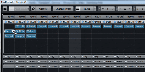
I also wanted to show that the clickable areas are LARGER than the graphics that represent the buttons. I click outside the button but still get the buttons function (in my example it bypasses the SoftClip plugin instead of opening the “choose plugin”-menu where I have UAD EMT 140 inserted…). Has that changed also?
I have said this before. A preference option to allow the buttons to be visible or hidden. Better yet, a button on the menu bar to toggle between the two states. Surely then everyone would be happy.
Trying to imagine having all these controls visible constantly - a ghastly sight. I guess they could redesign all the control graphics, they’d have to in order to make this work as an option, and that means it’s not just a simple fix, and will require resources … actually I’d rather they spend more time on fixing the actual bugs and addressing the real issues.
This is not an issue, it is, as the foregoing 4 pages show, an opinion dispute. Not saying it shouldn’t be considered, but first when the fixes have been made.