^
I prefer the option to shade the fader area (as pre C6) rather than just the fader cap.
That’s because I think I’d find it easier to see the shaded area in periferal vision, and (I expect, for me) it would be quicker to locate the pale colour-shading that covers that larger area - and always the SAME area - rather than a small fader cap that could be anywhere within that area.
For me, what’s of primary importance in the colour scheme isn’t whether or not it looks attractive - it’s whether it helps or hinders you when you’re using Cubase. If it can be made attractive as wel as ergonomic, that’s excellent; but I wouldn’t sacrifice any ergonomic benefits AT ALL for the sake of an elegant look.
Having no colouring options at all? … Not good IMHO. That’s why those little switch things that you can use to set off fire alarms aren’t painted the same colour as the wall that they’re on. And the sticking plasters that cooks use aren’t the same colour as the food they prepare.
And I wouldn’t ask Steinberg to paint my piano’s black keys white just because some people think that looks more restful.
I don’t care how it’s implemented, but if we don’t get some kind of event transparency back, I can’t use Cubase 6. It’s worthless to me without that one ‘feature.’
Short update:
I just saw on Dave’s computer a working prototype of Cubase’s mixer with colored fader caps. This feature will be available in the next supported update if everything (e.g. quality assurance testing) goes well.
By default the caps will be all as they are now. In the appearance settings there will be a slider where you can select the intensity of the color. Dead left means no color (as it is now) while dead right means full color saturation. Of course you can choose anything in between.
“Anything in between” … you DO mean (between no colour and full saturation) for ANY chosen colour for each fader cap? - ie, allowing the use of a different colour from the track-related one?
Will coloured caps be implemented instead of shading around the fader, like that in C5 and earlier? - I’m one of those who’d prefer the old kind of shading to fader caps only - I suspect it’s quicker/easier to pick out group/FX tracks (and others with user-specified shading) when the whole area round the fader is coloured instead of just the fader cap (which is smaller and could be anywhere in the fader area).
I’m sure this has been said before, but being able to re-order mixer channels without altering the project window track arrangement would be a preference for me. I had a session the other day with my old drummer pal, who uses DP7, he was going slightly mental over not being able to do this. I was struggling to defend Cubase on that front.
I agree.
I hope we’ll at least be able to chose any color we want for the fader cap.
Also I would like an option to colorcode the whole channel strip like in Protools or Reaper.
Wouldn’t it use the track color for the fader cap, and allow you to choose the intensity?
(I am not familiar with how these other software look, sorry.)
I personally find it humorous that the same midi / audio clip look that people called “toyish looking” in Sequel (by Cubase users) are now being praised in Cubase 6 as “very attractive”. I actually like them personally, but I’ve been looking at them for 3-4 years in Sequel.
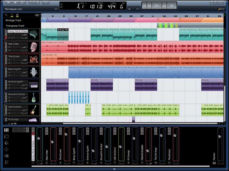
I always wonder what is this kind of project where there is only 1 track for the vocals, 1 for the drums and 1 for the guitars.
Anyway, I like the Sequel GUI, I like the icons in the arrangement view. But for those who work with 80 tracks instead of 11, we need serious options for organizing the project and identifying tracks, mostly in the mixer area.
I mean vocals and background vocals for the verse, vocals and background vocals for the chorus, drums → you already have 30 tracks there, add some guitars, keys, bass, synth, percussions, strings, reverbs, delays, a bridge in the song, or whatever arrangement you need and you end up with 60 to 100 tracks easily. I’m not even talking about symphonic orchestras arrangements.
That’s why I want colors, icons, or whatever tool that would help custumizing the mixer, and I don’t want it to be subtle in order to have a nice looking GUI, I want those colors to be obvious and efficient when I look at the mixer.
In a real console you can identify your channels because of the fader’s position, they are on the left, on the right or in the middle of the console (even if you have 2 or 3 layers in a digital console, it’s easier than scrolling a DAW’s mixer because the faders stay at the same place).
Whereas in a DAW you only display 20 channels at the time, and you scroll to the left or to the right to view more channels, so you need colors and icons to identify channels because your track is lost in the middle of 80 other tracks. The channels that are on the left could be off screen or on the right next time you look at the mixer. This is a huge difference IMHO.
I don’t suppose there’s any obligation on the programmers to be that restrictive - though SB could choose to be.
But, IMHO, that would be bad because then you could only have one colour-based classification scheme, instead of the two available before C6 - the track colour (which could relate to the instrument type, for instance) and the channel (fader-area) colour, which could signify group or FX channels (or - for the future - other channel types, if assignable colours were available).
As an example, before C6, groups of related instruments (drums, strings, etc) could be given the same track colour, and group tracks for the strings/drums, etc could have a separate fader-area colour to denote group tracks. Then it’s not only easy to pick out the group tracks, but also easy to see which type of instrument a group track includes - because the group track has not only the colour for the instrument type, but also the colour for group tracks.
If you can only have one colour, that ability is lost. Not only that: I suspect that it’s harder to see at a glance all the tracks with a particular fader-cap colour than it is to see all those with the same fader-area colour (because the fader caps are smaller and can be anywhere in the fader area).