Does anyone know of a SMuFL font that looks like the Capella 1800 font? I want to use it in Dorico. i have the font now, I just can’t get it working in Dorico.
Here is a link to what the font looks like:
Here are links to the directory that contains the two files I have that I think should make the font work but I’m not sure where to go next with this.
I’ve got a look at the shared font you mentioned above, the font looks to work somehow with Finale & Sibelius. Whereas with Dorico, the 133 glyphs need to be remapped à la SMuFL.
I might make it SMuFL compliant, but I just can’t promise when I’ll do as I’m very busy with teaching and making other musical projects.
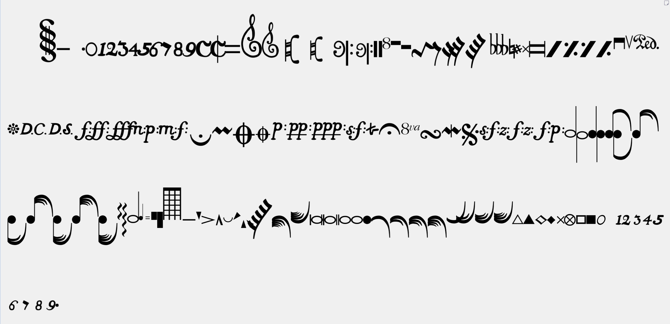
The screenshot looks nice, sound like this font is intended for church chants no ?
I find this font rather charming and think it would be lovely for choice projects. Do be sure to let us know if you manage to remap it. I would certainly be interested.
To me, this monstrosity of a font looks like what you’d get if you asked a 10 year old to design a poster containing musical symbols. Furthermore, some of the symbols (Ped., fermata, all articulations) look identical to their modern appearances. Whoever designed the font evidently didn’t have a firm grasp of circa 1800 notation. Many of the original printings of Beethoven’s compositions are available to view on the IMSLP website for all to see.
I was wondering why I recognized your name when you asked for permissions for the directory. I use RealScore as my default jazz font. I was trying to decide between RealScore and BopMusic. I also purchased The Copyist. I love your fonts.
My plan is to use Copyist for my classroom worksheets and BopMusic for all my jazz performance stuff.
For classical music I am currently using September 2.0.
Thanks for being a valuable NorFonts costumer Mark. For classical I think you can try Da Capo (Schott engraving style) and Scordatura (modern engraving style) and maybe when available my latest MEZZO (similar to Igor Engraver -late 90s) & MEZZA (similar to Henle engraving style).
What I’m really loving about the concept of SMuFL fonts, and I can’t believe it’s taken me long to think of it this way, is that it gives composers like me (transitioning away from sketching on paper) an opportunity to reclaim a written style - here, I can design my own clefs and noteheads, and it can be my own computerised style.
One day all looks a bit complicated for the limited time I have right now.
Has to be said clefs are a particular bug bear of mine - I don’t like the C (alto) clef of any modern font - I feel like it dominates the stave unnecessarily. I spend a good deal of time looking at scores where it can be as small as a little “c”, and it’s dominance seems to come from orchestral tradition - the many breitkopf editions etc. I am aware there are other C clefs in the smufl definition (and in bravura) but be fun to design my own