I came across this score and really liked the text font used here:
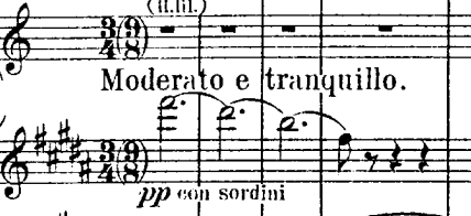
No idea if it’s considered old fashioned or problematic in any way but what I like about it is how it’s narrow, straight, thin and tall without becoming oval-like, if that’s the right way to describe it. All of my installed fonts tend to be much squarer and boxier, even the condensed versions like Minion Pro that I usually use which also seems a bit angled.
Do you know of a font that looks like this? I’d be grateful for recommendations. Thanks!
Like most music text, it’s a Century-esque ‘Modern’ face. I’d suggest something like ITC Century Book Condensed;

Don’t forget that Dorico’s Paragraph Styles let you adjust the ‘Stretch’, which you could use to achieve a more compressed look with a ‘Regular’ font.
Here’s Nepomuk at 90% Stretch, and 0.1pt Letter Spacing.

1 Like
This is pretty amazing, thank you Ben. ITC Century looks very close indeed, although the “r” in Nepomuk appears more like it for me.
Is there a book on text fonts used in music that you know of, to learn a bit more about all this?
EDIT: Ben, one more question (sorry!) - Googling for ITC Century and comparing its many versions, I’d also be curious to know - does the front in that score screenshot look “Light” to you?

I appreciate what I perceive as thinness but not sure if I’m using the right terms, etc.
[Speaks into dictaphone]: “Ideas for best-selling books…” ![]()
I doubt it!
No, I don’t think it’s the Light version: the Book Condensed, Book Italic Condensed, and Bold Condensed, Bold Italic Condensed are probably what you’re after.
Though there are various Century Schoolbooks that would also suffice, plus-or-minus Stretch. Both Apple and Microsoft bundle Century fonts. Don’t forget that Academico is an open-source interpretation of New Century Schoolbook.
I know times are hard, but that website looks a little sketchy. …
I did design Nepomuk to be quite tight, for use with lyrics, but it works very well in titling and expressions with a bit of letter spacing to open it up a bit.
Here’s MS’s Century Schoolbook and Academico (guess which!), at 75% and 5% letter spacing (in Affinity Publisher).

1 Like
That’s good to know - it was pretty high in the list of results. Meanwhile, MyFonts.com returned 628 results for “Century” so that will keep me busy ![]()
I’m playing around with Academico (that was a surprise!!) and Nepomuk to get a feel for them. To my uneducated eye, they both look very nice indeed, but there is something about the letter “r” in Academico and the uniform thinness or thickness of strokes in both that makes them more distinct from that score screenshot than ITC Century Book - I think. But it’s very hard for me to pinpoint these differences.
And perhaps the thinness of Finale Engraver makes the thickness of font strokes more noticeable?


I know we’re not supposed to get sidetracked on engraving questions, but those slur chains are making my eye twitch. Is that definitely correct?
1 Like
Probably not! Just trying to look at the text font relative to noteheads and shapes.
1 Like
Well, I do agree that the thinner font accentuates the heavier engraving strokes. I prefer the thicker found myself.
1 Like
There are many fonts that have the name ‘Century’ in them; it’s almost a style designation than a typeface name. Every different foundry has their own version of New Century Schoolbook, Century Old Style, etc,.
I do like Century Old Style SB by Scangraphic, which is one of the closest foundry fonts I’ve seen to ‘music type’.
1 Like
It’s beautiful, the little curve on the “d” looks quite striking to me.

I’m also wondering just from this browsing if Didot and Bodoni styles are somehow in a similar vein or perhaps related to Century.
For now, the ITC Century Book Condensed looks the closest. The other thing that I never quite thought about before is related to Dan’s comment - I’m realizing just now that I might prefer a thinner look overall.
Finale Engraver has very wide noteheads (but the flags are lovely). I would advise not making staff lines too thin – that’s a fault of computer notation on laser printers since the 80s.
Dorico’s defaults are either 1/10th of a space, I think; but I’d recommend anywhere between that as a minimum and 1/8th.
Yes, Bodoni and Didot are earlier font styles, and like music itself, the creators were influenced by previous designs, but invented their own style.
2 Likes
Thanks Ben, this was extremely education and useful. I’m going to get ITC Century Book and spend time with the manual. Cheers!
This would make a good condensed lyrics font. Eminently legible and yet compressed compared to standard fonts.
Not a book, but there was this thread from a while back where I posted a few pages from various publishers’ house style guides that contained their text settings. There’s some other relevant and useful music text info in that thread too.
2 Likes
I did try ITC Century Book Condensed as a lyric typeface, but I found it a little too condensed for my taste. Of course, these days, I could apply a Stretch % to it.
Ricordi used a ‘Music text’ typeface consistently in their plate engraved scores. Same with Durand. (I wonder what they use now – they’re all part of the same group now, I think.)
You know, I wondered about that, but hadn’t tested it yet. You’ve saved me $26.
@FredGUnn yes, I’ve had that thread bookmarked (and had switched to Minion Pro because you and Dan both mentioned it at different times, I think).
However, I must admit at the time most of the fonts discussed there looked like identical twins to me. @Romanos showed an example of Yana which I really liked (I can certainly relate to writing with a quill!).
It’s only yesterday, when I was struck with that very straight and narrow font and played around with replicating it, that I noticed a huge impact all these tiny details produce collectively. It’s been an eye-opener to say the least.
2 Likes
Welcome, friend.
And I warn you that you will never look at any professional publication again. Once you start noticing these details, you’ll start to notice all the things designed by people who *don’t see all these details (and it shows). ![]()
2 Likes
Thank you - so far, it’s been very interesting and more than a little addictive! And yes, I’ve been going through all the score pdf’s I have and looking through them for the second day in a row now (not to mention the manual, Engrave Mode and “Behind Bars”).
Here is one more font (Scotch Deck Roman and Light) that somehow feels like it embodies everything that I liked from that screenshot, except it’s not as narrow as I’d want.

If anyone reading this doesn’t like this font, I’d be really curious to understand what it is that they dislike. Thank you.